
The Atlantic has never felt narrower, yet the bridge between New York’s high-octane consumerism and London’s heritage-steeped elegance is paved with subtle, high-stakes distinctions. In the tech-driven landscape of 2026, Global Packaging Standards have moved beyond mere aesthetics. They are now the frontline of Identity Architecture.
At KIXX STUDIO, we’ve spent 8 years in the forge. We’ve seen the “scars” left by brands that tried to copy-paste a US strategy into the UK market, and failed. To win in Vera City, or any global tech hub, you need more than a logo; you need an International Appeal that understands the cultural pulse of both sides of the pond.
1. The Core Divergence: Narrative vs. Efficiency
While both markets are sprinting toward Minimalist Luxury, the “why” behind the design remains distinct. If you don’t understand the psychological driver of your audience, you’re just putting ink on cardboard.
The US Pulse: The “Hero” Narrative
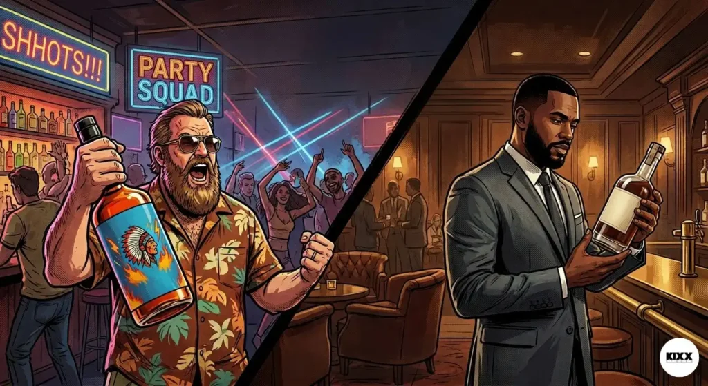
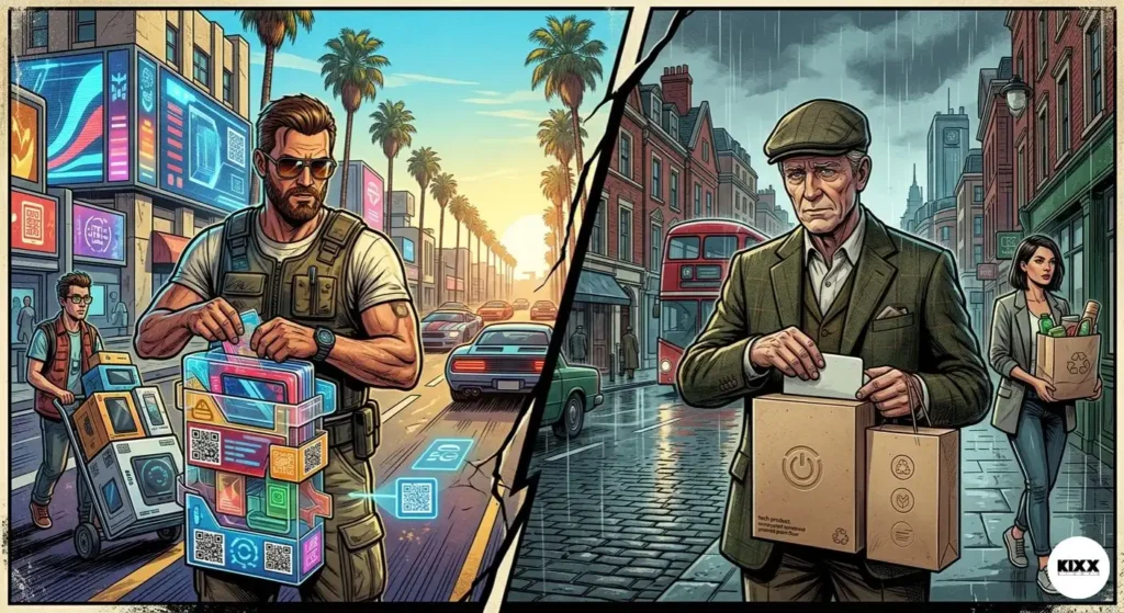
In the United States, packaging is a billboard. Even under the guise of minimalism, American brands lean into the “Hero” narrative. The design is built to justify the disruptor’s price tag immediately. It’s punchy, it’s bold, and it’s results-driven.
The American consumer is often looking for “The Solve.” They want to know, within milliseconds of visual contact, how this product elevates their status or solves their problem.
- The Look: Sharp lines, high-contrast palettes (The “Batman” aesthetic), and a focus on “Newness.”
- The Strategy: High-velocity UI/UX Architecture on the box itself, guiding the eye to the USP (Unique Selling Proposition) within three seconds.
- Typography: US brands in 2026 favor “Heavyweight Minimalists”, bold sans-serifs that communicate industrial strength and technological superiority.
The UK Pulse: The “Heritage” Whisper
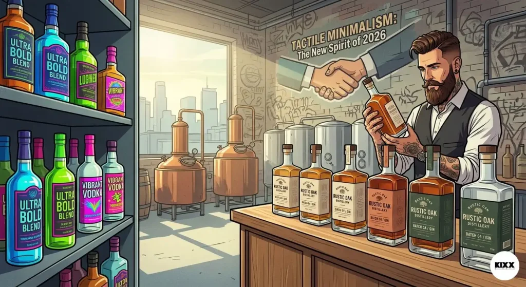
The UK market, particularly in the premium sector, values the “Heritage” whisper. Even the newest tech startup in Shoreditch wants to feel like it has 100 years of “scars” and wisdom. For the British consumer, blatant shouting is seen as a sign of weakness.
- The Look: Tactile textures, muted “Old World” tones, and sophisticated, custom-kerning typography.
- The Strategy: It’s about the “Linger.” The British consumer wants to feel the weight of the material and discover “easter eggs” in the copy.
- Subtlety as Power: In London, the most expensive bottle or box is often the one with the smallest logo. It’s an “if you know, you know” (IYKYK) culture.
2. 2026’s Shared North Star: High-End Restraint
Despite their differences, the elite tier of both markets has reached a consensus: Loud is dead. In 2026, High-End Restraint is the universal language of the “Power of the Few.”
The Death of “Flashy”
We’ve moved past the era of gold-foil-everything. Today, Premium Branding is signaled through technical sophistication rather than shiny distractions.
- Material Intelligence: Using lab-grown, sustainable substrates that feel like silk but are tougher than plastic. The “touch” of the packaging provides a sensory ROI that a digital ad never can.
- Structural Integrity: The unboxing experience is now a choreographed performance. At KIXX, we obsess over the “vacuum seal” effect, the specific speed at which a box lid slides off. If it’s too fast, it’s cheap. If it’s too slow, it’s frustrating.
- Monochromatic Authority: Using varying textures of the same color (matte black on gloss black) to create depth without visual noise. This is the “Apple meets Batman” core.
3. The 8-Year Lessons: Navigating the “Culture Gap”
At KIXX, we don’t just design; we perform Market Corrections. Here are the deep-dive lessons we’ve learned while bridging the US/UK divide over nearly a decade in the trenches.
I. Typography is a Dialect
A font that screams “Silicon Valley Disruptor” in San Francisco might feel “Aggressively Unrefined” in London. Conversely, a font that feels “Savile Row Elegant” in the UK can occasionally feel “Stuffy and Slow” to a US Founder.
We forge an Identity Architecture that sits in the “Vera City Neutral” zone, authoritative yet adaptable. We look for typefaces that possess “Global Gravitas”, fonts that have the structural integrity of US tech but the refined kerning of British luxury.
II. The “Hustler’s Smile” in Copy
American packaging copy is often direct: “The best. The fastest. The first.” It’s a sprint. UK packaging copy often uses a “Hustler’s Smile”, a bit of wit, a bit of understatement: “Precisely what you expected, and perhaps a bit more.” It’s a conversation.
For 2026, we recommend a blend for any brand seeking International Appeal: Direct impact with a sophisticated finish. Tell them what it does, but do it with enough charm that they want to keep the box on their shelf.
4. Technical Prowess: UI/UX Architecture in Physical Form
In 2026, we no longer separate “Digital” from “Physical.” Your packaging is the physical manifestation of your app’s UI.
Scannable Depth
High-net-worth individuals are busy. They need to “skim” your packaging just like they skim a blog. We use Logo Design and hierarchy to ensure the core message is received instantly. This is “Level 1” interaction. “Level 2” is for the lingerers, the ones who appreciate the micro-copy inside the lid or the textured pattern on the base of the box.
The Signal: Bridging the Gap
Modern packaging standards require a digital bridge. However, the days of the “ugly QR code” are over.
- Invisible Triggers: We integrate near-field communication (NFC) under the label.
- Minimalist Signal Codes: If a code must be visible, it is treated as a design element, etched or embossed into the material, leading the user directly to the Weekly Dossier or an exclusive digital portal.
5. The Sustainability Correction: Beyond the Cliché
In the past, “Eco-friendly” looked like brown cardboard and “raw” textures. In 2026, that is a “budget” look that kills ROI. Global Packaging Standards now demand “Invisible Sustainability.” The packaging must look like a high-end luxury artifact but be fully circular.
The US Trend: Techno-Sustainability
US brands are investing heavily in “Carbon-Negative Luxury.” This involves using recycled ocean plastics turned into high-gloss, premium resins that look like obsidian or marble. It’s about showing off the technology behind the recycling.
The UK Trend: Bio-Luxury
The UK is leading in “Regenerative Aesthetics.” We’re seeing mushroom-based foams that have the density of velvet or seaweed papers that feel like heavy-weight vellum. It’s about the raw, organic connection to the earth, refined for a Mayfair boardroom.
6. The 2026 Aesthetic: “The Dark Knight” of Branding
If 2020 was about “Minimalist White” (The Apple Store era), 2026 is about “Textured Dark.” We are seeing a global shift toward:
- Satin Finishes: Moving away from “High Gloss” which shows fingerprints (a “UX fail” in packaging).
- Weight as Quality: In both the US and UK, the physical weight of the package is the #1 subconscious indicator of price. If it’s light, it’s a toy. If it has heft, it’s an investment.
- Hidden Compartments: Building “Identity Architecture” into the box itself, magnets, hidden drawers, and layered unboxing that rewards the curious consumer.
7. Why This Matters for Founders & CEOs
If you are a Founder in the USA looking to penetrate the UK market (or vice versa), your packaging is your “Special Ops” team. It enters the room before you do. It sits on the desk of the CEO you’re trying to impress. It sits in the hands of the influencer who can make or break your launch.
If your packaging doesn’t align with local Global Packaging Standards, you are fighting an uphill battle. You are essentially speaking a different language and wondering why no one is listening.
The KIXX Strategy: We build for International Appeal. We don’t just follow trends; we set the “Vera City Standard.” We ensure your brand looks like it belongs in a penthouse in Manhattan and a boardroom in The City. We bridge the gap between US efficiency and UK elegance.
8. The ROI of Premium Forging
Let’s talk numbers. A strategic packaging overhaul isn’t an expense; it’s an equity play.
- Shelf Velocity: Brands that move to High-End Restraint see an average increase in “Shelf Velocity” because they stand out by not trying to stand out.
- Customer Lifetime Value (CLV): When a customer keeps your packaging because it feels “too good to throw away,” your brand stays in their home. That is constant, free impressions for years.
- Price Elasticity: Premium branding allows you to raise prices without losing volume. If the packaging looks like it costs $500, the consumer won’t blink at a $200 price tag.