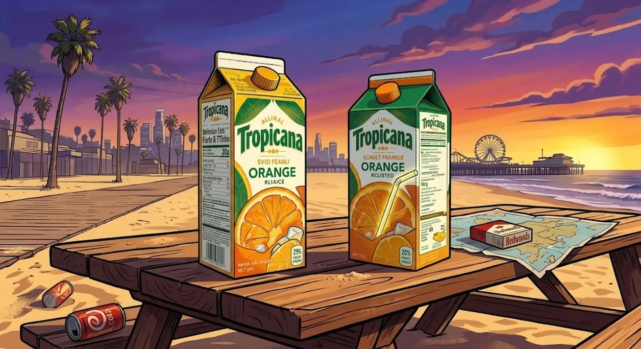

Why Tropicana Lost 50 Million in 30 Days: The Ultimate Redesign Disaster
- By: kixxdesignstudio@gmail.com
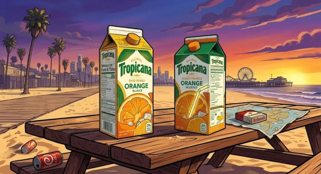
Key Takeaways
The Power of Recognition: Shoppers look for familiar visual cues like the famous orange with a straw. If you hide them, people cannot find your product.
Emotional Connection: Packaging is not just a box. It is an emotional contract between a brand and its loyal customers.
If It Is Not Broken, Do Not Fix It: Radical changes can alienate your core audience and instantly destroy decades of built-in trust.
The High Cost of Silence: Tropicana failed to understand how real people shop in grocery stores, leading to a massive financial penalty.
Have you ever walked into your favorite grocery store, looked at the shelves, and felt completely lost? You know exactly what you want to buy. You buy it every single week. But suddenly, you cannot find it anywhere. You blink, you look closer, and you feel a little bit frustrated. This is exactly what happened to millions of people in early 2009. It marks the beginning of a story about why Tropicana lost 50 million in 30 days, which remains one of the biggest corporate branding disasters in history.
Let me be honest with you. Orange juice is a big deal for families in the USA and the UK. It is a staple at the breakfast table. For decades, Tropicana was the undisputed king of that morning routine. People loved it, they trusted it, and they bought it without even thinking. Then, in January 2009, the company decided to change everything. They threw away their classic look and introduced a brand new box.
The results were immediate, and they were absolutely terrifying for the company executives. Sales plummeted by 20 percent in just one month. Competitors like Minute Maid stepped in and took those customers. In this massive, detailed post, we are going to look at exactly what went wrong. We will look at the psychology of the shoppers, the fatal mistakes in the design choices, and the massive lessons that every business owner must learn from this mistake.
The King of the Breakfast Table Before the Storm
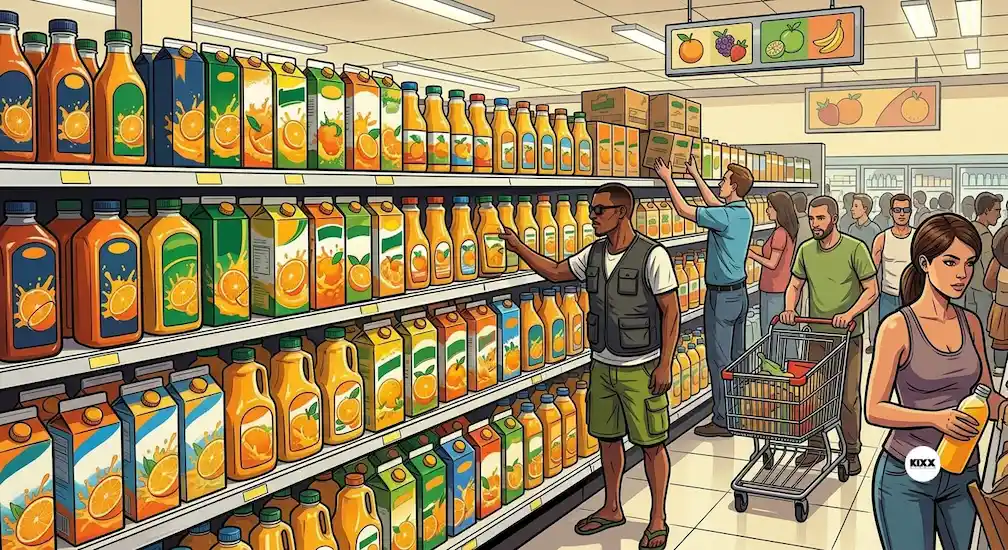
To understand why Tropicana lost 50 million in 30 days, we have to look at where they started. Before the year 2009, Tropicana was a brand that enjoyed incredible loyalty. Think about how you shop for groceries. You are usually in a hurry. You might have kids running around, or you are thinking about your long to-do list. You do not stand in front of the juice aisle reading every single label. You look for a visual cue.
For Tropicana, that visual cue was a beautiful, bright orange with a red and white striped straw stuck right into the middle of it. It was a brilliant piece of imagery. It told your brain instantly that this juice was fresh. It made you feel like you were drinking straight from the fruit itself. This image had been on the carton for years and years. It was a symbol of premium quality.
People were willing to pay a little bit extra for Tropicana because of this trust. The packaging felt warm, familiar, and premium. It stood out perfectly against all the generic store brands. It was a beautifully designed anchor for the entire company.
The Big Idea That Went Completely Wrong
So, why did they change it? This is the part that surprises most people. The company did not change the packaging because they were failing. They changed it because they wanted to look modern and progressive. They hired a high-profile advertising agency to give the brand a fresh look. The agency spent months working on a new campaign.
They wanted to create a design that was clean, minimalist, and sleek. At the time, minimalist design was becoming very popular. Companies like Apple were winning awards for making everything look simple and clean. The designers at the agency thought they could bring that same high-end, modern aesthetic to a carton of orange juice.
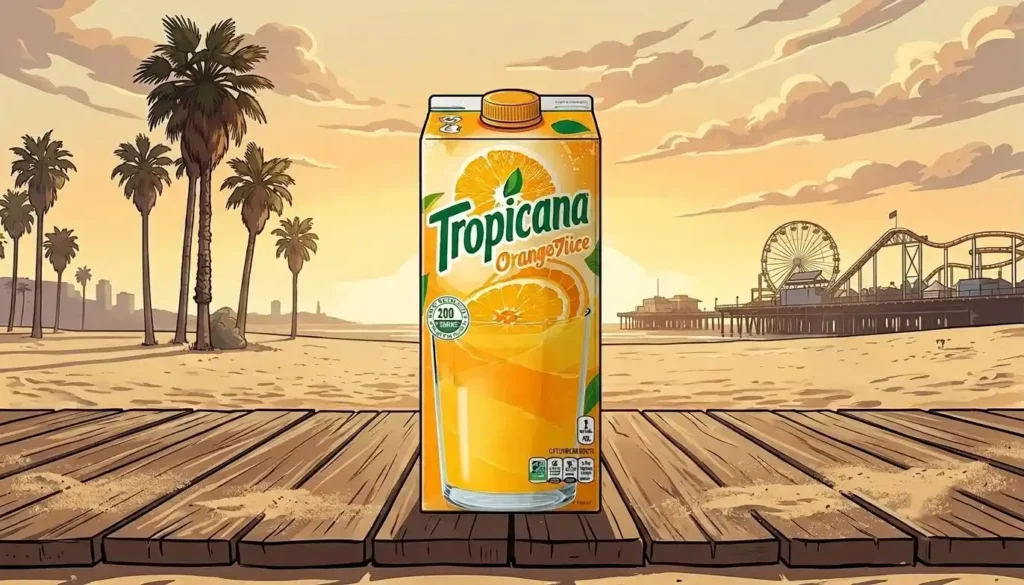
They decided to remove the famous orange with the straw. They replaced it with a large, glass cup filled with orange juice. They also changed the famous logo. Instead of the thick, dark font that stood out clearly, they used a thin, modern font that was turned sideways. They thought it looked like a beautiful piece of modern art.
+---------------------------------------------------------+
|  Time Period: 30 Days (Jan - Feb 2009)                  |
|  Sales Drop: 20% Decline                                |
|  Direct Revenue Loss: $33 Million                       |
|  Total Campaign Cost: $50+ Million                      |
+---------------------------------------------------------+
The Fatal Errors in the Typography and Logo
Let us talk about the logo change for a moment because it was a massive part of why Tropicana lost 50 million in 30 days. The original Tropicana logo was printed in a bold, dark green font. It sat proudly across the middle of the box. It was incredibly easy to read from several feet away.
In the new design, they took the logo, made the letters thin, and rotated it ninety degrees. It was printed vertically up the side of the box. This meant that if a shopper wanted to read the brand name, they had to tilt their head to the side.
Think of it this way, if you make your customers work hard just to read your name, you have already lost them. The thin font also lost all its authority. It looked weak and corporate. It did not have the friendly, wholesome energy of the original logo. It felt cold and distant, like a medical product rather than a delicious breakfast beverage.
Losing the Emotional Connection with Families
Good branding creates an emotional connection between the product and the consumer. For millions of families, Tropicana was connected to warm memories of family breakfasts, lazy Sunday mornings, and healthy living. The packaging was a big part of that feeling. It felt like an old friend sitting on the kitchen table.
When the new packaging arrived, it felt like that old friend had been replaced by a cold, corporate stranger. The new design was full of abstract ideas. For example, the designers made a special cap for the carton. The cap was shaped like a little orange, and it had a textured skin.
The idea was that when you opened the carton, you would feel like you were squeezing an orange. It sounded amazing in a boardroom presentation. But in reality, nobody cared about the cap. It was too small to make an impact, and it could not make up for the fact that the face of the carton looked completely blank and lifeless.
The Disastrous Flop of the "Squeeze" Campaign
The packaging redesign was accompanied by a massive advertising campaign that cost millions of dollars. The theme of the campaign was all about love and human connection. The billboards showed pictures of family members hugging, with the tagline “Squeeze, it’s natural.”
This campaign was meant to be deeply moving and human. But there was a massive disconnect between the ads and the product. The ads were all about warmth and emotion, but the new product packaging looked cold, sterile, and scientific. It looked like something you would buy in a pharmacy, not a grocery store.
People saw the beautiful ads, went to the store to buy the juice, and then could not find the product because the box looked nothing like the warmth shown in the advertisements. The entire marketing strategy fell apart because the visual chain was broken. Every piece of the puzzle was fighting against the other pieces.
How Competitors Celebrated the Blunder
When a giant leader like Tropicana stumbles this badly, the competition does not just sit around and watch. Competitors noticed the massive drop in Tropicana sales within days. Brands like Minute Maid and Florida’s Natural immediately capitalized on the situation.
They kept their classic, recognizable packaging exactly the same. They even launched promotions and discounts to attract the frustrated Tropicana customers who were wandering down the juice aisle in confusion. Once a customer switches to a new brand and realizes that it tastes just as good, it is incredibly hard to win them back.
Tropicana did not just lose money during those thirty days. They lost long-term market share. They handed their most loyal customers over to their rivals on a silver platter, all because they wanted to be trendy and modern.
The Instant Backlash from Real Consumers
In today’s world, we are used to seeing people complain on social media when a company changes something. But back in early 2009, social media was still quite young. There was no Instagram or TikTok to drive instant trends. Despite that, the backlash against Tropicana was massive, loud, and immediate.
The company was flooded with thousands of angry emails, phone calls, and letters from real consumers. People were not just saying they disliked the design. They were genuinely upset. Some letters described the new design as ugly, stupid, and cheap.
Many loyal buyers felt that the company was trying to trick them by putting a lower-quality juice inside a cheaper-looking box. The level of passion from the consumers shocked the executives at Tropicana. They had no idea that people cared so deeply about a simple cardboard carton.
The Dramatic Rescue Mission and the Reversion
Cotton and laid paper stocks are popular choices for premium whiskey labels. They have a natural, slightly rough texture that feels expensive and authentic. Many of the world’s most prestigious whiskey brands use paper that feels more like fine stationery than a label.
Uncoated paper stocks take ink differently than coated ones. Colors look slightly more muted and organic, which actually works in favor of brands going for a heritage or craft aesthetic.
For ultra-premium expressions, some brands even use hand-torn edges on their labels, giving each bottle a one-of-a-kind feel that perfectly reinforces a “handcrafted” story.
The Role of Embossing and Debossing
Embossing raises elements of the label off the surface. Debossing presses them in. Both techniques add a three-dimensional quality to a label that you simply cannot achieve with flat printing.
A debossed crest or embossed brand name is something a customer can feel with their fingertip. It says, “This brand paid attention to every single detail.” And when someone is about to spend thirty, fifty, or a hundred dollars on a bottle of whiskey, that kind of attention to detail matters enormously.
Five Vital Lessons Every Business Must Learn
The historic blunder of why Tropicana lost 50 million in 30 days is taught in business schools all over the world today. It is a perfect case study of what happens when you lose touch with your customers. Let us look at the key lessons that we can take away from this classic mistake.
1. Do Not Destroy Your Visual Equity
Your visual equity is the set of design elements that people instantly associate with your brand. For Tropicana, that was the orange and the straw. If you have an element that everyone recognizes, you must protect it at all costs. You can update it, refresh it, or make it cleaner, but you must never throw it in the trash.
2. Design for the Consumer, Not the Boardroom
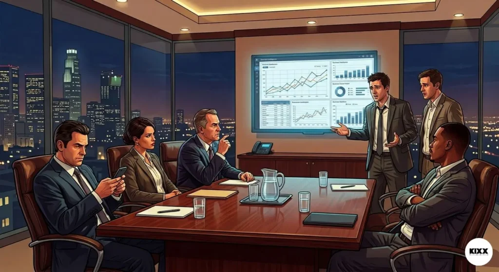
The minimalist design looked wonderful on a large projector screen in a beautifully lit conference room. It won praise from design experts who love modern art. But it failed because it was not designed for a busy mother dragging two kids through a crowded supermarket at seven o’clock on a Friday night. Always design for the real world environment.
3. Radical Changes Require Warning
If you absolutely must change your look drastically, you have to prepare your audience. You cannot just swap the product overnight and expect people to figure it out. You need to run educational campaigns that say, “New Look, Same Great Taste!” Tropicana gave no warning, leaving their audience feeling abandoned and confused.
4. Innovation Should Solve a Real Problem
The old packaging was not broken. It was highly effective, deeply loved, and drove billions of dollars in sales. The change was made purely for the sake of change. Before you innovate, ask yourself what problem you are trying to solve. If you cannot name a real problem, you are risking your business for no reason.
5. Listen to Customer Feedback Immediately
The only good thing Tropicana did during this entire situation was their quick response to the backlash. They did not let their corporate pride get in the way of survival. When they realized the ship was sinking, they turned it around immediately. If they had waited six months to fix the issue, the brand might have been completely destroyed.
The Lingering Visual Impact on Modern Product Design
It is interesting to see how this event changed the design world. For a long time after the Tropicana failure, large consumer brands became very terrified of making major packaging changes. They realized that a bad design could literally break a company.
Today, if you look at major brands in the supermarket, you will notice that changes are made very slowly and subtly. A logo might become slightly rounder, or a color might become a tiny bit brighter, but the core image always stays the same.
Brands have learned to respect the sub-conscious habits of shoppers. They know that consistency is worth millions of dollars. Innovation is wonderful, but in the world of fast-moving consumer goods, recognition is the ultimate currency.
Conclusion
The story of why Tropicana lost 50 million in 30 days is a powerful reminder that the customer is always the ultimate boss. A company can spend millions on expert designers, high-end agencies, and emotional advertising campaigns, but if the product does not connect with the real person standing in the grocery store aisle, it will fail.
Design is not just about making things look pretty or modern. It is about communication, utility, and building long-term trust. Tropicana forgot that their packaging belonged to the millions of families who put it on their tables every morning, not just to the executives in the boardroom. Thankfully, they listened to their customers and brought back the classic look before it was too late.
What do you think about this famous design disaster? Do you remember when the boxes changed back in 2009? I would love to hear your thoughts on this story. Please leave a comment down below and share your own experiences with brands changing your favorite products!
Frequently Asked Questions
Why did Tropicana decide to change its packaging design in 2009?
Tropicana wanted to modernize the brand and appeal to a newer generation of consumers. They wanted to create a sleek, minimalist aesthetic that looked clean and contemporary, similar to the design trends that were successful in the technology sector at that time. They also wanted to emphasize the idea of fresh, natural juice through a new creative advertising campaign.
What was the main element missing from the new Tropicana design?
The most important missing element was the famous graphic of a whole orange with a red and white striped straw stuck directly into it. This image had served as the primary trademark and visual anchor for the brand for decades, allowing customers to locate the product instantly on crowded supermarket shelves.
How much market share did Tropicana lose during the packaging failure?
Tropicana suffered a staggering 20 percent drop in sales volume within just 30 days of launching the new packaging. This sudden drop cost the company over 33 million dollars in direct revenue, plus the 35 million dollars spent on the advertising campaign and design process, leading to a total loss of over 50 million dollars.
How did regular consumers react to the new minimalist design?
Consumers reacted with immediate frustration, anger, and confusion. The company received thousands of direct complaints via email and telephone calls. Many loyal customers stated that the new box looked cheap, generic, and like a low-quality supermarket brand, which made them feel disconnected from their favorite product.
How did Tropicana fix the packaging disaster?
Tropicana responded to the crisis by announcing a complete reversal just 35 days after the launch. They scrapped the new modern design entirely and returned to an updated version of their classic packaging, bringing back the beloved orange and straw imagery to restore brand recognition and consumer trust.