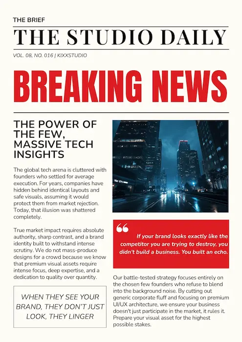

Your Brand Looks Professional. So Does Everyone Else.
- By: kixxdesignstudio@gmail.com

Why playing it safe might be the riskiest branding decision you’re making.
Let’s play a little game.
Imagine you’re walking down a street filled with businesses. Every storefront looks polished. Every logo is perfectly aligned. Every colour palette feels carefully selected. Everything screams professionalism.
Now, try to remember just one of them.
Can’t?
Congratulations. You’ve just experienced what happens when brands focus so much on looking professional that they forget to be memorable.
And that’s a bigger problem than most businesses realise.
Because somewhere along the way, “looking professional” became the ultimate branding goal. Businesses started choosing the same safe colours, the same familiar fonts, the same predictable layouts, and the same stock photos of people enthusiastically shaking hands in glass offices.
Apparently, every business meeting happens in a glass office. Who knew?
But here’s the uncomfortable truth: A brand can look absolutely perfect and still have absolutely nothing to say.
And in a world where everyone is fighting for attention, being forgettable is an expensive habit.
Let’s talk about why.
01. The Professional Trap
Every business wants to look professional.
Understandably so. Nobody wants their brand to look like it was designed during a lunch break using whatever fonts happened to be available.
Professional design builds credibility. It tells customers that a business takes itself seriously, pays attention to detail, and can be trusted.
But there’s a catch.
When every business follows the same definition of professionalism, they slowly begin to look like variations of the same company.
Think about it.
A consulting firm chooses navy blue because it communicates trust. A financial company chooses navy blue for the same reason. A technology startup chooses navy blue because, well, apparently the internet has decided that innovation comes in shades of blue.
Before long, an entire industry starts looking like it attended the same branding workshop and copied the notes.
The problem isn’t professionalism itself. The problem is treating it as the entire personality of a brand.
Professionalism builds credibility. But credibility alone doesn’t make people remember you.
Your brand needs more than a polished appearance. It needs a point of view.

02. The Great Brand Uniform
Let’s talk about the visual uniform businesses unknowingly wear.
You know the one.
- A clean sans-serif font.
- A tasteful shade of blue.
- A minimalist logo.
- A photograph of a smiling team.
- A website with the words “Innovative Solutions” somewhere above the fold.
It’s not necessarily bad design. In fact, many of these choices work perfectly well in the right context.
But when everyone makes the same choices for the same reasons, the result is a marketplace full of visual déjà vu.
Scroll through a dozen company websites and you might start wondering whether you’ve accidentally opened the same website twelve times.
Different company names. Different services. Identical personalities.
And this isn’t limited to websites.
It happens in packaging, social media, advertising, presentations, and even brand messaging. Businesses borrow visual trends because they feel safe, familiar, and easy to approve.
Nobody gets fired for choosing the familiar option, right?
Except that the familiar option rarely gives customers a reason to choose you over someone else.
When your brand looks like everyone else’s, customers have to work harder to understand why you’re different.
And customers aren’t exactly lining up to do extra homework.
Your brand should make recognition easier, not turn it into a guessing game.
03. Safe Doesn't Always Mean Smart
Let’s clear something up.
Being distinctive doesn’t mean being strange for the sake of attention.
You don’t need a neon-green logo, a typeface nobody can read, or a website that looks like it was designed during a particularly creative thunderstorm.
A brand can be bold and still be thoughtful. It can be unconventional and still be clear. It can have personality without sacrificing credibility.

The real question isn’t whether your design is safe or risky.
It’s whether your design is intentional.
A strong brand understands its audience, its positioning, and the impression it wants to create. Every visual decision supports that identity.
A weak brand simply asks, “Does this look professional?”
A stronger brand asks:
- Does this feel like us?
- Will our audience recognise us?
- Are we communicating something meaningful?
- Could a competitor use this exact identity without changing a thing?
That last question is particularly useful.
If your brand could be swapped with a competitor’s and nobody would notice, you may have a differentiation problem.
And no, changing the logo from blue to slightly different blue doesn’t count as a personality transformation.
Safe design can build comfort. Distinctive design creates recognition. The goal is to know when your brand needs each.
04. The Cost of Being Forgettable
Here’s where the conversation gets serious.
Being forgettable isn’t just a creative disappointment. It can affect how people discover, recognise, and choose a business.
Imagine two brands offering nearly identical products.
Brand A looks familiar. Its messaging is generic. Its identity blends into the category.
Brand B has a clear personality. Its visual identity is consistent. Its messaging gives people a reason to remember it.
Both might offer excellent products. Both might have capable teams. Both might deliver on their promises.
But Brand B has made it easier for customers to recognise what makes it different.
That matters.
Because customers encounter brands across multiple touchpoints — social media, websites, advertisements, recommendations, packaging, and conversations. Every interaction is an opportunity to build familiarity.
A distinctive and consistent identity helps those interactions connect.
Without it, businesses risk becoming just another name in a crowded market.

And when customers can’t recall your brand, you have fewer opportunities to enter their consideration set.
It’s a little like attending a party, having perfectly good conversations, and leaving without anyone remembering your name.
At least at a party, you can blame the music.
In business, the problem might be your brand.
Attention gets people to notice you. Recognition helps them remember you. And a clear identity gives them something worth remembering.
05. Personality Is Not Decoration
This is where branding gets interesting.
A brand’s personality isn’t something you sprinkle on top after the logo is finished.
It should influence the entire experience.
Think about the brands you remember. Chances are, you don’t remember them simply because their logos were attractive.
You remember how they made you feel. Their tone of voice. Their attitude. Their distinctive way of presenting an idea. The consistency between what they promise and what they deliver.
That’s brand personality at work.
And it goes much deeper than choosing a quirky font or adding a clever tagline.
A distinctive brand identity brings together several elements:
Visual identity: Colours, typography, imagery, composition, and design language that create recognition.
Verbal identity: The words, tone, and messaging that make a brand sound like itself rather than a corporate template.
Brand behaviour: The way a business communicates, responds, serves, and shows up across customer interactions.
Consistency: The discipline to make all these elements feel connected, whether someone encounters the brand on a website, a business card, or a social media post.
When these elements work together, the brand starts to feel like a real personality rather than a collection of design files.
And that’s the difference between having a logo and building an identity.
A logo identifies your business.
A brand identity helps people understand and remember it.
06. How to Stand Out Without Trying Too Hard
So, how do you build a distinctive brand without turning the entire design process into an experiment in creative chaos?
Start with these five principles.
1. Know What Makes You Different
Before choosing colours or exploring logo concepts, understand what genuinely separates your business from the competition.
It could be your approach, your expertise, your audience, your philosophy, or the experience you offer.
Don’t invent a personality just because your competitors have one.
Find the truth about your business and build from there.
2. Stop Designing for Approval Alone
A design that makes everyone in the meeting comfortable isn’t automatically a design that will resonate with customers.
Of course, feedback matters. Strategy matters. Practicality matters.
But if every creative decision is made to avoid disagreement, your brand may end up with an identity that nobody dislikes and nobody remembers.
Sometimes the right creative decision needs a little explanation before it gets approval.
That’s part of the job.
3. Build Recognition Through Consistency
Being distinctive doesn’t require reinventing your brand every week.
In fact, constantly changing your colours, typography, messaging, and visual style can make recognition harder.
Choose a clear identity and apply it consistently across the places where your audience encounters you.
Repetition, when done thoughtfully, helps familiarity grow.
Your audience shouldn’t need a detective to confirm that your Instagram post, website, and packaging belong to the same business.
4. Give Your Brand a Voice
If your brand could speak, how would it sound?
Formal and authoritative? Warm and approachable? Witty and unconventional? Calm and thoughtful?
There isn’t one correct answer.
The important thing is to choose a voice that fits your brand and audience, then use it consistently.
And please, don’t make every business sound like it was written by the same committee of enthusiastic corporate robots.
A little humanity goes a long way.
5. Design for Recognition, Not Just Applause
A beautiful design might earn a compliment.
A distinctive identity can build familiarity over time.
Of course, the two aren’t mutually exclusive. Great design can and should do both.
But the next time you evaluate a creative direction, look beyond whether it looks impressive in a presentation.
Ask whether it communicates the brand’s character, whether it stands apart in its category, and whether people could recognise it again.
Because the real test of branding isn’t how good it looks in a design mockup.
It’s how well it works in the real world.
07. The Real Goal Isn't to Be Different. It's to Be Recognizably You.
Let’s bring this back to where we started.
Your brand doesn’t need to be the loudest in the room. It doesn’t need to follow every trend, challenge every convention, or reinvent the wheel just to prove that it has a creative department.
It needs clarity.
It needs character.
And it needs the confidence to communicate what makes it different.
Professionalism is important. A strong visual identity is important. Trust is important.
But none of these should come at the cost of your brand’s individuality.
Because the world doesn’t need another perfectly polished brand that looks suspiciously like the last ten.
It needs businesses with something meaningful to say — and the creative confidence to say it in their own way.
Good design gets attention. Great branding gets remembered.
And if your brand is going to take up space in someone’s mind, it might as well be for something more interesting than a shade of corporate blue.
At KIXX Studio, we believe branding should do more than make businesses look good. It should help them mean something, stand for something, and become impossible to confuse with everyone else.
Because looking professional is a good start.
Being remembered is the point.
KIXX Studio