
The Death of the Clean Startup Vector: What Follows Corporate Fluff?
- By: kixxdesignstudio@gmail.com
Key Takeaways
- The Homogenization Trap: Generic vector illustrations make your premium tech platform look exactly like a low-cost commodity.
- The New Luxury Standard: Modern tech aesthetics are adopting high-contrast, dark-mode-first interfaces reminiscent of elite automotive and gaming brands.
- Trust Over Playfulness: Investors and enterprise buyers associate cartoon vectors with unvalidated software, demanding mature visual architecture instead.
- Typographic Authority: Custom geometric typography and stark structural grids are replacing decorative shapes to build instant credibility.
Let me be honest with you. If you have spent more than five minutes browsing software landing pages recently, you have experienced severe visual fatigue. You click on a link, the page loads, and you are immediately greeted by the exact same imagery.
You see those purple or blue cartoon human figures with abnormally long limbs, standing next to a massive gear or floating near an abstract cloud. It is supposed to feel friendly, accessible, and modern.
This is the part that surprises everyone, it no longer works. Instead of signaling innovation, it signals that your product lacks an original point of view. We are officially witnessing The Death of the Clean Startup Vector, a massive cultural shift where generic corporate fluff is being discarded by elite tech players. Buyers and investors are completely numb to the friendly cartoon aesthetic, forcing a radical evolution in how technical brands present themselves to the western market.
The Birth and Overuse of Corporate Memphis
Here is something most people miss about the history of software web design. The flat, colorful vector illustration style had a very specific, practical purpose when it first appeared. Tech giants needed a way to make complex, abstract tools feel non-threatening to the average consumer.
The aesthetic became known across design circles as the Corporate Memphis style. It relied on simple geometric shapes, flat pastel color palettes, and cheerful, character-driven narratives. It was incredibly cheap to produce and quick to scale across massive website architectures.
The problem started when every single early-stage startup downloaded the exact same open-source vector graphics packs. Suddenly, an open-source security database website looked identical to a human resources platform. This extreme duplication destroyed any sense of brand distinctiveness.
Why B2B Tech Brands All Look Alike’ to analyze the direct economic losses startups face when using cloned color schemes.
Why Friendly Cartoons Damage Enterprise Trust
Think of it this way. If you are a founder trying to sell a six-figure enterprise software contract to a conservative chief information security officer, your visual identity is your initial handshake. That officer needs to feel absolute confidence in your platform stability and technical discipline.
When your landing page looks like a children’s storybook filled with colorful vector characters, you create an immediate psychological barrier. The buyer’s subconscious mind scans the page and classifies the product as a lightweight, unproven prototype. Playfulness undermines authority.
					+---------------------------------------------------------+
|             THE REJECTION CYCLE OF CORPORATE FLUFF      |
+---------------------------------------------------------+
| Step 1: User lands on a generic vector layout.          |
| Step 2: Subconscious categorizes it as a cheap template.|
| Step 3: High cognitive fatigue from predictable design.  |
| Step 4: User exits without registering brand identity.  |
+---------------------------------------------------------+
In a market saturated with rapid technological deployments, safety and sophistication are the elements that close deals. If your brand looks like a temporary playground, enterprise buyers will take their budgets to legacy competitors who look like concrete institutions.
What Follows Corporate Fluff? The Era of Dark Luxury
As The Death of the Clean Startup Vector clears out the cluttered landscape, a beautiful new aesthetic paradigm is stepping into the spotlight. Top-tier software companies are entirely abandoning the bright, sterile white backgrounds of the past decade.
The modern tech space is aggressively shifting toward premium luxury brand positioning. Think of the design language used by high-end luxury watchmakers, premium automotive brands, and elite video game studios. It is dark, cinematic, and deeply mysterious.
					+---------------------------------------------------------+
|       OLD TECH VS. NEW TECH branding trends             |
+---------------------------------------------------------+
| Pastel Color Schemes -> High-Contrast Dark Frameworks   |
| Flat Cartoon Vectors -> Raw Photography & 3D Textures   |
| Friendly Soft Fonts  -> Monospaced & Heavy Typography  |
| Abstract Fluff Icons -> Raw Interface Component Previews|
+---------------------------------------------------------+
This dark luxury aesthetic relies on deep contrast ratios, subtle ambient lighting effects, and flawless micro-interactions. It doesn’t scream for your attention with bright pastel pinks and purples. It sits confidently on the screen, letting the quality of the layout command respect.
Ahrefs Global Search Intent Analytics to prove how search volume for premium design system development is spiking globally.
Weaponizing Raw UI Architecture as Art
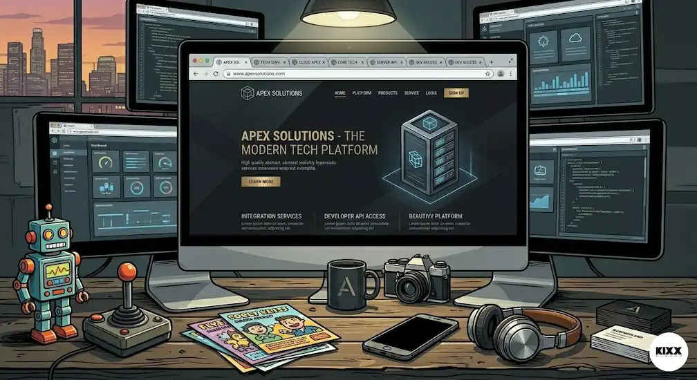
One of the most exciting trends replacing the clean startup vector is the use of real product user interfaces as the primary marketing artwork. Instead of hiding the actual software behind an abstract cartoon illustration, founders are showing the raw product.
This approach requires beautiful, immaculate product design standards. Landing pages are now featuring zoomed-in, interactive fragments of software code, complex data dashboards, and pristine typography layout structures.
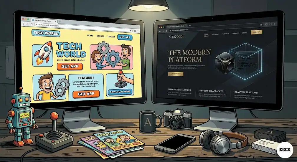
When a user lands on your site, they see exactly what they will be working inside every single day. This creates immediate transparency and eliminates visual guesswork. It shows that the engineering team is proud of the craftsmanship embedded within the product infrastructure.
The Monospaced and Geometric Typographic Revolution
If you want to understand where the future of software branding is heading, you have to look directly at the typography choices of market leaders. The soft, rounded, playful sans-serif typefaces that defined the early app store era are rapidly disappearing.
They are being systematically replaced by custom, heavy geometric fonts and industrial monospaced typefaces. Monospaced typography instantly connects a tech brand to the raw, unfiltered world of software engineering and code execution.
It feels mechanical, highly structured, and intentional. When combined with wide tracking and deep contrast backgrounds, your text stops acting as simple content and transforms into a powerful component of the visual brand architecture.
Implementing Tactile Glassmorphism and 3D Realism
As flat vector art dies, texture is returning to the internet in a massive way. Designers are utilizing advanced styling systems to build interfaces that feel physically real to the touch, often referred to as tactile glassmorphism.
Imagine digital layers that look like frosted glass panels, catching realistic light reflections as you scroll down the page. These elements use subtle borders, soft drop shadows, and dark contrast gradients to create three-dimensional depth on a two-dimensional screen.
					+---------------------------------------------------------+
|             THE TACTILE DESIGN BLUEPRINT                |
+---------------------------------------------------------+
| Component 1: Frosted glass backing plates               |
| Component 2: 1px crisp glowing border treatments        |
| Component 3: Deep ambient drop shadow layering          |
| Component 4: Contextual lighting source reflections      |
+---------------------------------------------------------+
This structural depth helps the human brain organize information much faster. It reduces cognitive load by clearly defining where one piece of content ends and another section begins. It elevates a basic webpage into a premium interactive digital environment.
The Psychology of Dark UI Architecture to connect how high-contrast dark modes optimize consumer focus and retention
The Micro-Grid and Neo-Brutalist Layout Structure
Another massive shift following The Death of the Clean Startup Vector is the emergence of visible grid layouts. Instead of floating elements in vast, borderless white spaces, modern tech branding trends embrace structural alignment.
Thin, subtle grid lines separate content blocks, reminiscent of architectural blue prints or high-end print design journals. This layout style is heavily inspired by neo-brutalism and classic swiss design principles.
It gives a website a sense of permanence and absolute structural stability. It implies that every pixel has been engineered with extreme intentionality. For a technical buyer, this grid system provides a sense of comfort, knowing the company values structural order over decorative chaos.
Transitioning Your Startup System to the New Era
If your current company platform is still relying on legacy corporate fluff illustrations, do not panic. The transition toward a modern premium visual system can be achieved through a series of intentional iterations.
Start by auditing your primary customer touchpoints. Look at your homepage hero section, your marketing email headers, and your social media share assets. Remove the generic vector graphics and replace them with high-fidelity, dark-themed platform screenshots or raw typographic statements.
					+---------------------------------------------------------+
|              URGENT AUDIT CHECKLIST                     |
+---------------------------------------------------------+
| [ ] Purge all long-limbed vector illustrations.         |
| [ ] Introduce clean architectural layout grids.         |
| [ ] Increase contrast levels on core metric displays.    |
| [ ] Replace soft fonts with structured typography.      |
+---------------------------------------------------------+
Work on increasing the overall contrast levels across your entire product ecosystem. Ensure that your core data visualization points are completely unobstructed by decorative background shapes. Let your actual technology do the heavy lifting of capturing human attention.
The Global Economic Reward of Visual Differentiation
Let us speak clearly about the commercial value of dropping corporate fluff. In a global landscape where thousands of SaaS platforms launch every single quarter, attention is the single most expensive acquisition metric.
When your brand matches the visual background noise of the entire internet, your customer acquisition costs skyrocket. You are forced to spend double the amount on ad budgets just to get noticed because your visual identity is completely invisible.
When you adopt a premium, dark, highly structured aesthetic, you immediately step out of the commodity bucket. You instantly establish yourself as an undisputed premium option in your category. You earn the power to demand higher price points because your presentation looks expensive, professional, and entirely uncopyable.
SEMRUSH Enterprise SaaS Marketing Analysis to provide readers with data on user click-through rates regarding custom vs. templated designs.
Conclusion: Step Boldly Into the Future of Tech Aesthetics
The era of hiding mediocre software product engineering behind colorful, friendly cartoon vectors is completely over. The Death of the Clean Startup Vector is a mandatory evolution that rewards bold, disciplined tech companies while quietly archiving teams that refuse to change.
The future of digital design belongs to brands that respect the intelligence, time, and focus of their audience. By implementing cinematic dark layouts, rigid grid systems, beautiful custom typography, and transparent product views, your startup builds a lasting visual monopoly that refuses to be ignored.
What does your current software landing page communicate to your target market? Are you still relying on corporate fluff, or are you ready to embrace a premium visual identity? Let me know your thoughts in the comments section below, and share this post with your creative product design team!
Frequently Asked Questions
What exactly does 'The Death of the Clean Startup Vector' mean for early-stage companies?
It means that relying on open-source, flat vector cartoon illustrations to establish corporate credibility is no longer an effective strategy. Startups must build custom, mature, and premium visual identity frameworks to differentiate themselves in a saturated market and win enterprise-level client trust.
Why did the Corporate Memphis illustration style become so popular initially?
The style gained massive popularity because it was highly accessible, friendly, and incredibly easy for non-designers to scale using automated vector asset libraries. It allowed tech companies to soften their cold digital products and present a warm, human face to a global consumer base that was cautious about rapid technological changes.
How does a dark mode design layout improve software brand perception?
A dark-mode-first framework naturally conveys luxury, premium positioning, and superior engineering discipline. It dramatically reduces visual eye strain for professional power users who spend long hours looking at screens, while creating high-contrast layouts that make essential product metrics stand out beautifully.
Is flat website design completely dead across all tech sectors?
Flat design is not entirely gone, but it has evolved into a far more sophisticated style. It now integrates realistic lighting models, subtle depth lines, geometric grids, and premium typography scales rather than relying on the simplistic, textureless, pastel-colored layouts that dominated the past decade of corporate software branding.
How can a technical startup showcase its product without using abstract illustrations?
Startups can weaponize their actual user interface design as marketing art. By using high-definition, interactive fragments of their code bases, elegant data dashboard layouts, and clean typographic content blocks directly on their homepages, they provide immediate clarity and build profound visual trust with their target audience.