
Why Minimalist Packaging is Winning in 2026: A Guide for Luxury Brands
- By: kixxdesignstudio@gmail.com

Key Takeaways
- Minimalist packaging is no longer a niche trend. In 2026, it is the dominant visual language of luxury.
- Consumers today associate simplicity with confidence, quality, and trust.
- Clean packaging reduces production costs while simultaneously increasing perceived value.
- Sustainable minimalism is a powerful combination that modern buyers actively seek out.
- Getting minimalist packaging right requires just as much thought and skill as complex design, sometimes more.
Introduction
Less is more. You have probably heard that phrase a hundred times. But in 2026, it has stopped being a design philosophy and started being a business strategy that is genuinely moving product off shelves.
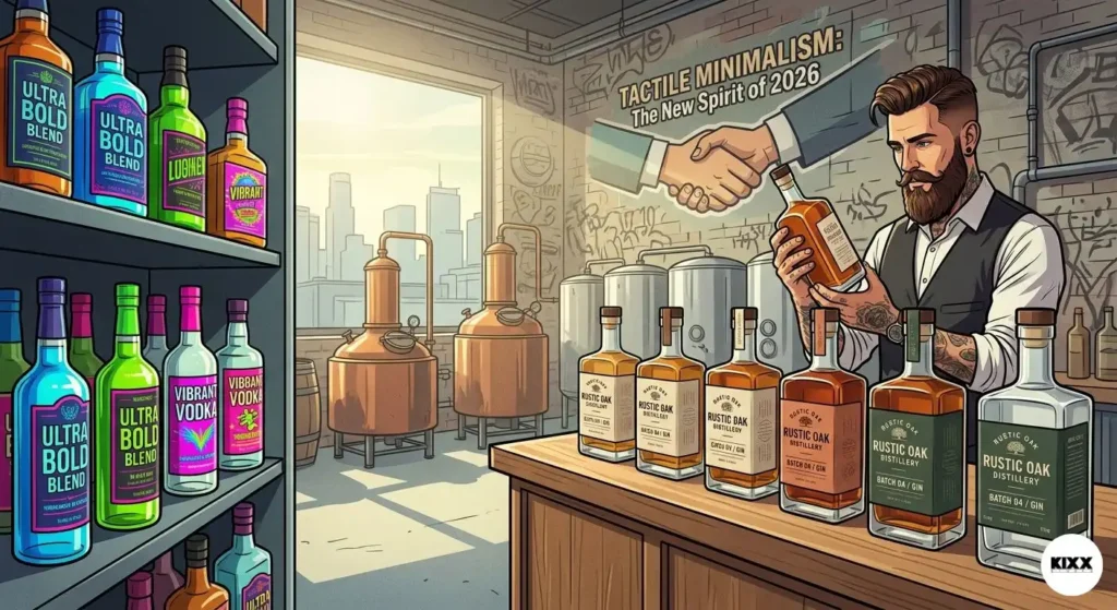
Minimalist packaging is having its biggest moment ever. And not just in boutique skincare or high-end stationery. It is showing up everywhere: in food, fragrance, fashion, electronics, spirits, and wellness. The brands leading the charge are not doing it because it is trendy. They are doing it because it works.
Here is what is fascinating. The move toward clean, quiet, uncluttered packaging has actually accelerated in the last two years. Consumers are more visually overwhelmed than ever before. They scroll through thousands of images every single day. So when a piece of packaging lands in front of them that says nothing except “I am exactly what you need,” something clicks.
This guide is for anyone who wants to understand why minimalist packaging has become the hallmark of luxury in 2026, and how to get it right.
1. What Minimalist Packaging Actually Means (It Is Not Just White Space)
Let me clear something up right away. Minimalist packaging does not simply mean slapping your logo on a white box and calling it a day. That is not minimalism. That is laziness dressed up as design.
Real minimalist packaging is the result of enormous creative restraint. It is about making deliberate choices. Choosing one font instead of four. Choosing one color instead of a rainbow. Removing every single element that does not earn its place on the pack. And then refining what is left until every inch of it feels intentional.
Think of it this way. A minimalist pack is like a room that has been carefully edited. The furniture is chosen with precision. Nothing is there just to fill space. Every object serves a purpose and adds to the overall feeling. That is exactly what great minimalist packaging does.
The Difference Between Minimal and Empty
This is the part that surprises most people. A minimalist label can feel incredibly rich and full of meaning, even if there are only five words and one graphic element on it.
The secret is in the quality of what you keep. If the typeface you choose is genuinely beautiful, it carries the whole design. If the single color you use is exactly right for your brand, it communicates everything. If the material you print on has a tactile quality that rewards the touch, the pack feels luxurious even if the ink coverage is less than ten percent of the surface.
Minimalist design demands that every remaining element does heavy lifting. There is no room to hide behind busyness. That is why it is so hard to do well, and why when it is done well, it feels so impressive.
Why Luxury Brands Specifically Are Embracing This
Luxury has always been about what you do not say as much as what you do. Old-money wealth has never shouted. The most expensive hotels do not have flashing signs. The most prestigious fashion houses often have the quietest storefronts.
Minimalist packaging speaks that same language. It projects a kind of confident calm that says, “We do not need to try hard to impress you. The quality speaks for itself.” For luxury brands, that is an enormously powerful message.
2. The Psychology Behind Why Minimalist Packaging Feels Premium
Here is something most people do not know. When you look at a cluttered package, your brain actually has to work harder. It has to process more information, filter out the noise, and find the signal. That extra effort, even though it only takes a fraction of a second, creates a subconscious feeling of effort and friction.
When you look at a clean, minimal package, your brain processes it almost instantly. And that ease of processing is experienced as elegance. Fluency equals beauty. It is that simple.
Psychologists call this “processing fluency,” and it is one of the most powerful and underappreciated forces in design. Designs that are easy to process feel more trustworthy, more intelligent, and more premium. Minimalist packaging literally triggers this response.
How Negative Space Builds Value
Negative space, the empty areas of a design, is not wasted space. In minimalist packaging, it is one of the most important design tools available.
White space around a logo makes the logo feel more important. Space around text makes the text feel more considered and authoritative. A product shown against a clean, open background feels more valuable than the same product surrounded by competing visual information.
This is why luxury department stores typically have wide aisles and generous display cases. Scarcity of visual clutter signals abundance of care. The same principle scales all the way down to the packaging of a single product.
The Trust Signal of Simplicity
Think about the last time you received a letter or document that was dense with text, bullet points, footnotes, and disclaimers. Did it make you more or less trusting of what it was saying?
Now think about a one-line message delivered with perfect clarity. Which felt more confident?
Brands that use minimalist packaging are making a visual statement: “We have nothing to hide. We are not trying to dazzle you with distractions. The product is good enough to stand on its own.” That kind of confidence resonates deeply with today’s buyers, who are more skeptical of marketing than ever before
3. Minimalist Packaging and Sustainability: A Perfect Partnership
One of the biggest reasons minimalist packaging is winning in 2026 is that it aligns naturally with sustainability. And sustainability is no longer a niche concern. It is a mainstream expectation, especially among the premium and luxury consumer base.
Less ink. Less material. Fewer layers. Smaller footprint. These are the natural byproducts of a minimalist design approach, and they map directly onto the environmental commitments that luxury brands are increasingly making.
Here is something interesting. When a brand reduces its packaging complexity and communicates that reduction as a conscious environmental choice, it earns two wins at once. The pack looks more premium. And the brand looks more responsible. That is a powerful double benefit.
The Rise of Sustainable Luxury Packaging
In 2026, the most talked-about packaging innovations in the luxury space are almost universally minimalist in aesthetic. Recycled paper stocks with natural finishes. Glass bottles with minimal labeling. Molded pulp boxes with subtle embossing. Refillable containers with clean, timeless design.
These materials reward restraint. A heavily printed, laminated label looks completely wrong on recycled board. A foil-stamped, plasticky finish undermines a message of environmental care. Minimalist packaging and sustainable materials are natural allies because they speak the same visual language, one of honesty, simplicity, and respect.
What Buyers Actually Think About This
Here is the honest truth. Sustainable packaging that looks beautiful is the most effective kind. Research consistently shows that consumers respond much more strongly to eco-friendly packaging when it also feels premium and well-designed.
Put simply, if a brand makes its packaging sustainable but ugly, customers feel vaguely guilty about buying it. If a brand makes its packaging sustainable and gorgeous, customers feel great about buying it and tell their friends. Minimalist sustainable packaging hits that sweet spot every time.
4. Real Brand Examples That Show Minimalist Packaging Done Right
Looking at real-world examples is the best way to understand what great minimalist packaging actually looks like in practice. The brands that have mastered this approach are scattered across many different categories, but they share the same underlying principles.
Aesop, the Australian skincare brand, is probably the most studied example of minimalist packaging done to perfection. Every product comes in the same amber glass or matte plastic bottle, with a clean white label, consistent typography, and botanical ingredient names listed in plain text. There is nothing decorative. And yet the overall effect is overwhelmingly luxurious. The consistency itself becomes the design statement.
Apple’s product packaging has become one of the most widely copied minimalist designs in the world. Clean white boxes. Minimal text. A single centered image of the product. The unboxing experience is choreographed like a ritual, and the packaging’s simplicity is a huge part of why people keep the boxes long after the product is out.
Byredo, the Swedish fragrance house, uses simple matte black or white packaging with precise typography and almost no decoration. The restraint is total. And the result is that their products photograph beautifully, look expensive on a shelf, and feel completely different from the busy, illustrative packaging that dominated perfumery for decades.
What These Brands Have in Common
Every one of these brands commits fully. They do not hedge. They do not add one extra design element “just in case.” They make a choice and they stick with it, across every product, every format, every touch point.
That commitment is visible. And it builds a kind of brand trust that is very difficult to achieve with complex, busy packaging. When a consumer picks up an Aesop product for the first time, they immediately understand the brand’s values without reading a single word. That is the power of minimalist packaging done right.
The Role of Embossing and Debossing
Embossing raises elements of the label off the surface. Debossing presses them in. Both techniques add a three-dimensional quality to a label that you simply cannot achieve with flat printing.
A debossed crest or embossed brand name is something a customer can feel with their fingertip. It says, “This brand paid attention to every single detail.” And when someone is about to spend thirty, fifty, or a hundred dollars on a bottle of whiskey, that kind of attention to detail matters enormously.
5. How to Get Minimalist Packaging Right for Your Luxury Brand
If you are a brand owner or designer thinking about moving toward a more minimal aesthetic, the most important thing to understand is this. Simplicity is not easy. It takes more thought, not less.
The temptation when you start stripping elements from a design is to keep going until there is almost nothing left. But that approach misses the point. Minimalism is not about removing everything. It is about keeping only what is perfect.
Start With Your Brand's One Core Idea
Before you touch a single design element, ask yourself this question. If your brand could only say one thing, what would it be?
For some brands, that one thing is heritage. For others, it is purity. For others, it is innovation. Whatever that one thing is, it should be the filter for every design decision you make.
If your one thing is purity, your packaging should feel clean, natural, and unprocessed. The material choices, the color palette, the typography, all of it should reinforce that single idea.
If your one thing is heritage, your minimal pack might use a single, carefully drawn crest or a precisely chosen period typeface that carries a century of visual history in its letterforms.
The discipline of choosing one thing and building the entire design around it is what separates great minimalist packaging from packaging that is merely sparse.
Choosing the Right Materials for a Minimal Design
In minimalist packaging, the material becomes the message in a way that it rarely does with busier designs. When there is less ink and fewer decorative elements, the surface quality of the substrate takes center stage.
This means material choice is more important than ever. A beautiful, slightly textured uncoated paper stock at 350gsm communicates quality without a single decorative element. A poor-quality coated stock undermines even the cleanest design.
Consider weight, texture, and finish as design elements, not as afterthoughts. The way a package feels in the hand should reinforce the same message as how it looks. Premium weight signals premium content. A matte, natural finish signals craft and care. A barely-there silk finish signals refinement.
Typography Is Everything
In minimalist packaging, typography carries more weight than in any other design context. When you remove everything else, the fonts you choose become the primary communication tool.
This is not the place to use a font you found for free online. The typeface on a minimalist luxury pack needs to be exceptional. It needs to look beautiful at every size, from the large brand name down to the smallest regulatory text. It needs to feel right for the brand’s personality. And it needs to be utterly readable, because on a minimal pack, the typography is the first and sometimes only thing the eye rests on.
Invest in type. Commission custom lettering if the budget allows. Use a limited type family consistently across every piece of packaging. This kind of typographic consistency is one of the clearest signals of a brand that takes its visual identity seriously.
6. Common Mistakes Brands Make When Trying to Go Minimal
Not every brand that attempts minimalist packaging gets it right. In fact, some of the most common packaging mistakes I see come from brands that are trying to look minimal without fully committing to the approach.
Here are the mistakes to watch for and avoid.
The first is inconsistency. A minimalist pack only works if the entire brand universe is consistent. If your packaging is clean and sparse but your website is busy and colourful and your social media is chaotic, the minimal pack looks like an accident rather than a strategy.
The second is cutting corners on quality. Minimalist packaging reveals every flaw. A cheap paper stock, an inconsistent print finish, a slightly off-center die cut, these things are invisible on a busy label because there is too much else going on. On a clean, minimal label, they scream.
The third is confusing minimal with vague. A minimal label still needs to clearly communicate what the product is and who it is for. Removing every word in the name of minimalism crosses the line from confident restraint into frustrating obscurity. Keep what the buyer needs. Remove what they do not.
The fourth is forgetting about scale. A minimal design that looks beautiful on a 500ml bottle might look lost and sad on a 50ml travel size. Always design for every size and format in the range, not just the hero product.
Conclusion
Minimalist packaging has moved from a design trend to a genuine commercial advantage, and in 2026 that advantage is bigger than ever. The brands that are leading in the luxury space are almost universally the ones that have embraced simplicity as a strategy, not just as an aesthetic.
What we have covered in this post adds up to a clear picture. Minimalism works because it respects the intelligence of the buyer. It signals confidence and quality without shouting. It pairs naturally with sustainability goals. It creates memorable, distinctive brand identities that hold up over time. And it rewards the kind of careful, thoughtful craftsmanship that luxury consumers genuinely value.
Getting it right is not easy. It requires clarity about your brand’s core idea, investment in quality materials and typography, and the discipline to resist adding just one more element. But when it comes together, the result is packaging that does not just sit on a shelf. It starts a conversation. It earns repeat purchases. It gets shared on social media. It builds the kind of brand love that no amount of busy design can create.
If you are thinking about making the move toward minimalism for your brand, I hope this guide has given you a solid starting point. I would love to know what you think. Which minimalist brands do you find most inspiring? Drop a comment below and share your thoughts. And if this post has been useful to you, please pass it along to someone who might need it. Great design deserves a bigger audience.