
VERA CITY , The “neon arms race” is officially over.
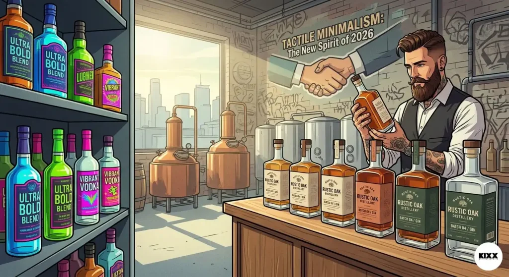
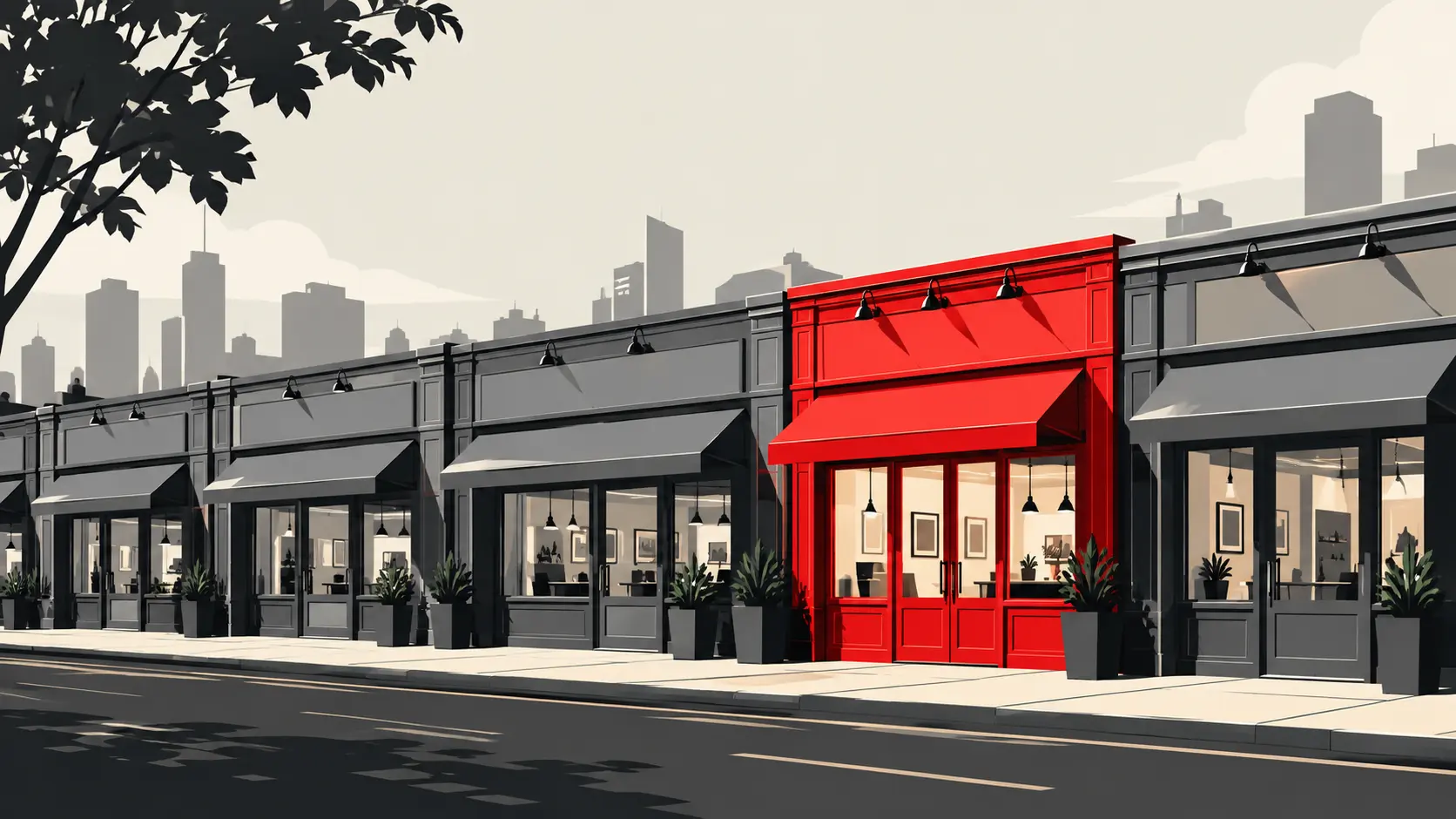
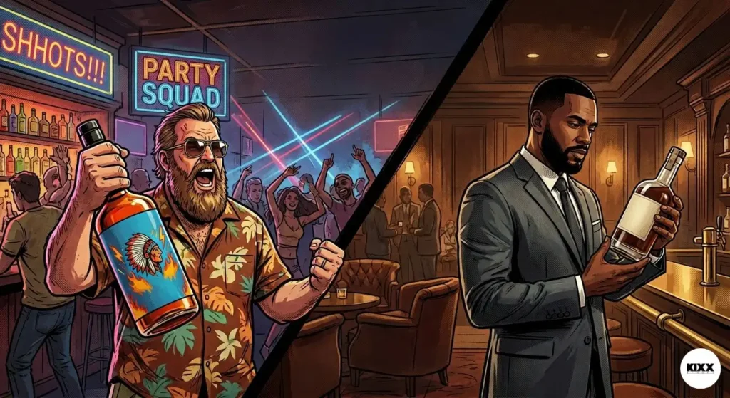
For the last decade, micro-distilleries across the United States believed that to survive on a crowded shelf in Manhattan or Mayfair, they had to scream. We saw fluorescent labels, oversized typography, and metallic foils that could blind a passerby. It was a race to the bottom of the visual barrel.
But as we cross the mid-point of 2026, the data from The Studio Daily is clear: The most expensive bottles in the world are becoming the quietest. The shift from “Bold Graphics” to “Tactile Minimalism” isn’t just a design preference, it’s a survival mechanism for the elite.
The Death of the “Loud” Label
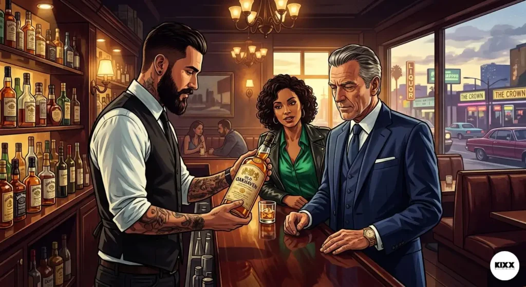
In high-stakes markets like New York and London, the consumer has changed. The tech disruptors and hedge fund titans who drive premium spirits sales are overstimulated. Their lives are lived through high-resolution screens and loud digital notifications.
When they reach for a bottle of whiskey, they aren’t looking for more digital noise. They are looking for a physical anchor.
At KIXX STUDIO, we’ve analyzed the “8 years of scars” in the spirits trade. The conclusion? Bold colors are now perceived as “cheap” or “mass-market.” Tactile minimalism, focusing on the feel of the paper, the weight of the glass, and the depth of the emboss, is how you signal true 2026 luxury.
The Moonshine Hills Case Study: A Masterclass in Texture
Look at the recent overhaul of Moonshine Hills. A brand that originated with a “rugged, colorful” outlaw aesthetic found itself hitting a ceiling. They couldn’t break into the $150+ “Legacy” tier because they looked like a craft beer project, not a high-end investment.
The KIXX Correction: We stripped the “Loud Graphics.” We removed the three-color illustration of the Appalachian mountains. What did we replace it with?
- The Texture: A heavy, 120lb cotton-fiber paper that feels like a vintage bank note.
- The Emboss: A blind-embossed topographic map of the hills, visible only when the light hits it at 180°C.
- The Hook: A single, high-build UV varnish on the logo. You don’t see it from across the room; you feel it the moment your thumb hits the bottle.
The result? Moonshine Hills didn’t just increase their price point; they changed their audience. They stopped being a “gift shop” bottle and became a “boardroom” bottle.
Why “Texture” Trumps “Graphics” in 2026
1. The Haptic Bond
Psychology tells us that the sense of touch is more closely linked to trust than sight. Anyone can print a loud color. Not everyone can engineer a bottle that feels like a piece of architecture. When a buyer in a London boutique feels the “tooth” of a premium label, a subconscious “trust signal” is sent to the brain.
2. The Linger Factor
“Loud” graphics are processed instantly and dismissed just as fast. Tactile minimalism requires the consumer to linger. They turn the bottle in their hands to see the light catch the texture. In that extra 4 seconds of interaction, the sale is made.
3. The “Apple meets Batman” Silhouette
We design for the “Special Ops” of the bar cart. This means using “non-colors”, charcoal, bone, obsidian, and deep forest greens, where the design is carved into the material rather than slapped onto it.
The 2026 Verdict for Founders
If your micro-distillery is still trying to win with “bolder” oranges or “brighter” blues, you are fighting a war that ended three years ago. The founders who are winning in Vera City, NYC, and London are those who understand that luxury is felt, not just seen.
At KIXX STUDIO, we don’t just sell design. We sell the “Power of the Few.” We help you ditch the noise so your brand can finally be heard.
The KIXX Promise: “In a world of loud amateurs, we build the silent authorities.”
Is your brand shouting into the void? It’s time to stop looking for a designer and start looking for an architect. The forge is hot.
[Signal Us, Re-Forge Your Identity] [Download the 2026 Spirits Dossier]
Reported by: The Studio Daily Editorial TeamArchive: Strategy // Spirits // International TradeLocation: KIXX STUDIO, Vera City