
Quiet luxury liquor packaging. In the high-stakes world of American spirits, the loudest person in the room is rarely the most powerful. For decades, the “top shelf” was defined by a visual shouting match: gold foil, embossed dragons, script fonts that looked like 18th-century marriage certificates, and labels so busy they required a roadmap to navigate.
But look closely at the winners in 2026. The shift is undeniable. From the bourbon trail in Kentucky to the craft gin labs of Brooklyn, the heavyweights are stripping back. They are ditching the noise. They are choosing to linger rather than scream.
At KIXX STUDIO, we call this the “Identity Pivot.” After 8 years of forging brands for founders who play for keeps, we’ve seen the “loud” designs fail the test of time. Here is why the most successful US spirit brands are embracing the minimalist forge and why “Quiet Luxury” is the new tactical advantage.

1. The Psychology of the “Quiet Flex.”
The modern high-net-worth consumer in the USA and UK has developed a sensory allergy to traditional “luxury” tropes. In an era of digital overstimulation, a cluttered label feels like a desperate plea for attention. When a brand screams, it signals insecurity. When it whispers, it signals dominance.
The Confidence of Negative Space
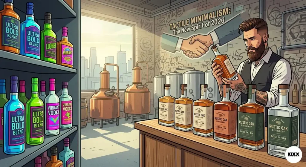
Minimalism is the ultimate signal of confidence. When a brand utilizes expansive negative space, the “white space” of the design world, they are telling the consumer: “Our liquid is so good, we don’t need to distract you with glitter.” This is the “Hustler’s Smile” in physical form. Think of the transition in the tequila market. Ten years ago, bottles were topped with oversized sombreros or intricate glass sculptures. Today, the brands commanding the highest per-bottle price points, like those coming out of the “Vera City” mindset, use clean, lab-style labels and industrial-grade glass. They rely on the clarity of the spirit itself to do the talking.
The Premiumization Strategy
This isn’t just an aesthetic choice; it’s a calculated premiumization strategy. By removing elements, you increase the perceived value of what remains. A single, perfectly executed serif font on a heavy glass bottle carries more weight than a dozen holographic stickers. This is about the “Power of the Few”, few colors, few lines, but maximum impact.
2. UI/UX Architecture: The Bottle as an Interface
At KIXX, we don’t just look at a bottle as a container; we look at it as a User Interface (UI). The “User Experience” (UX) starts the moment a customer’s eyes scan the shelf and ends when the glass hits the table.
The 0.5-Second Registration
In a physical store or a digital app like ReserveBar, your brand has approximately 0.5 seconds to register. “Loud” designs, those with overlapping textures and competing fonts, become a blurred mess at a distance or at 150×150 pixels on a smartphone screen.
A “Minimalist Luxury” design, however, retains its silhouette. We design for the Silhouette Factor. If you can’t recognize the brand from its shadow, the design is too loud and not distinct enough. We strip away the “chrome” to reveal the architecture.
Information Hierarchy
Traditional brands fail because they try to tell the whole story on the front label: the history, the ingredients, the tasting notes, the founder’s signature, and the award medals. That’s not a brand; that’s a brochure.
Modern US spirit brands are adopting a “layered” UX:
- The Hook: A singular, iconic logo or wordmark.
- The Detail: The proof and age statement, presented in high-contrast, readable typography.
- The Discovery: The “Easter eggs”, the subtle textures or hidden quotes found only upon closer inspection (the “linger” phase).
3. The “Apple meets Batman” Aesthetic
This is the KIXX signature. To dominate a modern tech-driven hub, your spirit brand needs to bridge the gap between “Heritage” and “Future.”
The Apple Side: Precision and Purity
Apple taught the world that the box is as important as the phone. Spirit brands are now adopting this “unboxing” mentality. This means perfectly flush caps, labels with tactile “tooth” (the texture of the paper), and colors that feel intentional, not accidental. We’re seeing a rise in “Non-Color” palettes: bone whites, slate greys, and matte blacks.
The Batman Side: The Dark Knight of the Bar Cart
If Apple is the precision, Batman is the mood. The “Batman” aesthetic is about the “Special Ops” feel, moody, architectural, and slightly aggressive.
We are seeing American whiskey brands move away from the “Old West” cliché. No more burnt edges on paper or fake “wanted poster” fonts. Instead, we see:
- Matte Black Glass: Shielding the liquid and adding an air of mystery.
- Industrial Wax Seals: Not the messy red wax of the past, but precision-molded seals that feel like a component of a high-end watch.
- Monolithic Shapes: Bottles that look like they were carved from a single block of obsidian.
4. The Physics of Luxury: Glass and Tactility
When you “ditch the loud,” the physical materials have to work twice as hard. As a studio with 8 years of “lessons and scars,” we know that the weight of the glass is often more important than the logo on it.
The Haptic Feedback
In Western markets, weight equals worth. A “loud” brand often uses cheap, thin glass hidden behind a massive label. A “minimalist” brand uses heavy, ultra-clear flint glass with a thick base (the “punt”).
When a customer picks up a bottle, their brain processes the Haptic Feedback. If the bottle feels substantial, the brain pre-registers the taste as “smooth” and “premium” before the seal is even broken. This is the “KIXX Promise” in action, we design for the hand, not just the eye.
Light as a Design Element
Minimalist designs allow light to interact with the liquid. In the spirits world, the color of the liquid, the deep amber of a bourbon or the crystal clarity of a gin, is your primary brand color. By ditching “loud” wrap-around labels, brands allow the spirit to act as its own marketing.
5. Sustainability: The New Minimalist Mandate
“Loud” design is often synonymous with waste. Excessive foil, plastic neck sleeves, and multi-layered labels are becoming liabilities in a market that demands environmental accountability.
The Lean Brand
The “Quiet” movement is inherently more sustainable.
- Direct-to-Glass Printing: By screen-printing the brand directly onto the bottle, you eliminate the need for paper and adhesives entirely. It’s cleaner, it’s more expensive to execute correctly, and it looks infinitely more “Special Ops.”
- Modular Packaging: Designing bottles that are beautiful enough to be repurposed as carafes or decor. This is the ultimate “linger”, the brand stays in the consumer’s home long after the spirit is gone.
6. The “8-Year Scar”: Avoiding the Generic Trap
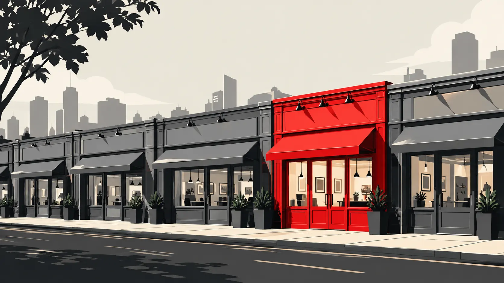
There is a danger in minimalism: the “Sea of Sameness.” If everyone goes minimal, how do you stand out? This is where many agencies fail, but where KIXX STUDIO thrives.
We avoid “Generic Minimalism.” We don’t just use Helvetica and call it a day. We find the One Sharp Edge.
Heritage Modernism
You take the “scars” of your distillery’s history, the year founded, the specific copper pot used, the latitude and longitude of the warehouse, and you present them with a razor-sharp, modern edge. You don’t hide the history; you frame it in a way that feels relevant to a founder in 2026.
It’s about being a “Modern Classic.” Like a tailored suit or a stealth bomber, the details are only visible to those who know where to look.
7. The Global Context: From Vera City to the World
Whether your brand is based in Kentucky or London, your competition is global. The “Vera City” aura represents the high-stakes energy of global commerce. In this environment, your brand is a tool for recruitment and a signal of status.
Founders and CEOs don’t want a bottle that looks like a souvenir. They want a bottle that looks like a trophy. They want a brand that reflects their own “Hustler’s Smile”, the confidence of someone who has already won and doesn’t need to brag about it.
8. Conclusion: The Power of the Few
The trend of ditching loud designs isn’t a “phase”, it’s an evolution of the human eye and the global market. As the US spirit market matures, the brands that survive will be the ones that understand that less is not just more; less is better.
You don’t need a louder voice; you need a better story, told through a cleaner lens. You need a brand that doesn’t just sit on a shelf, but commands the environment. At KIXX STUDIO, we specialize in that command. We don’t take on every project. We take on the “Chosen Few” who are ready to stop shouting and start leading.
The KIXX Promise:
“We don’t just follow trends; we anticipate the shifts that define the next decade. We don’t just build brands; we forge legacies that command attention in a world designed to distract.”
Your brand is your greatest asset. Don’t let it get lost in the noise.