
7 Secret Elements of Premium Whiskey Label Design That Drive Sales
- By: kixxdesignstudio@gmail.com
Key Takeaways
- A great whiskey label design does most of the selling before a single drop is poured.
- Color, typography, and texture all work together to trigger an emotional response in buyers.
- Premium labels communicate trust, heritage, and quality without saying a single word.
- Small details like paper weight and foil stamping can make a huge difference in how a
bottle is perceived. - Understanding these seven elements can help distilleries, designers, and brand owners
Create labels that truly convert.
Introduction
Here is something most people do not know. When a customer picks up a bottle of whiskey in a shop, they have already made up their mind about it within three seconds. Three seconds. That is less time than it takes to tie your shoelace.
That snap decision is almost entirely driven by the label. Not the liquid inside. Not the price tag. The label.
Whiskey label design is one of the most powerful and most underestimated tools in the entire spirits industry. The right design can take an unknown brand and make it feel like it has been around for a hundred years. The wrong design can make even the finest whiskey gather dust on the shelf.
In this post, we are going to look at the seven secret elements that separate a forgettable whiskey label from one that genuinely drives sales. Whether you are a distiller, a designer, a brand owner, or just someone who loves a good dram and wonders why certain bottles catch your eye, this one is for you.
1. The Story Your Label Tells at First Glance
Before a buyer reads a single word on your label, they feel something. That feeling is the story your whiskey label design is silently telling them.
Think of it this way. Imagine two bottles sitting side by side. One has a busy, cluttered label with ten different fonts and a faded photograph. The other has a clean, confident crest on a cream-colored background with one strong typeface and a deep amber color palette. Which one says “premium”? Which one do you trust?
The best whiskey labels tell a cohesive story through every single visual choice. They communicate heritage, craftsmanship, and confidence without using a single word. This is called visual storytelling, and it is the foundation of great spirits packaging.
Heritage Cues That Build Instant Trust
Heritage cues are design elements that suggest age, tradition, and time-tested quality. These can include things like:
Illustrated crests or coats of arms. Vintage-style borders. Hand-lettered typography. Engraving-style illustrations. Roman numerals for the year. Maps of the distillery region.
Now, here is the thing. You do not need to be a 200-year-old distillery to use heritage cues. Many successful new craft whiskey brands use these elements to establish a sense of tradition from day one. It is about the feeling, not the facts.
The trick is to use these elements authentically. If your whiskey is made in Kentucky, lean into that. If your brand has a founding story, find a way to hint at it visually. Buyers love feeling like they are part of something with a history, even if that history is only five years old.
Finding Your Brand's Core Visual Identity
Before you design a label, you need to know what your brand stands for. Is it rugged and bold? Smooth and refined? Wild and adventurous? Each of these personalities translates into a completely different set of design choices.
Rugged brands might use dark backgrounds, heavy serif fonts, and raw textures. Refined brands might go for cream-colored stock, elegant thin lettering, and subtle gold foil. Adventure brands might use dramatic landscapes or bold illustrated scenes.
Knowing your core visual identity is the first step. Everything else flows from there.
2. Typography: The Voice of Your Whiskey Label Design
If the overall design is the story, then typography is the voice that tells it. And just like a real voice, it carries emotion, character, and authority.
Let me be honest with you. Most people do not consciously notice the fonts on a whiskey label. But they absolutely feel them. A bold, heavy serif font feels powerful and confident. A delicate script font feels crafted and artisan. A clean modern sans-serif feels fresh and approachable.
The best whiskey label designs use typography with intention. They do not just pick a font because it looks nice. They pick a font because it says the right thing about the whiskey inside.
Pairing Fonts for Maximum Impact
Most premium whiskey labels use two fonts, sometimes three. The key is in how they work together.
Typically, the brand name is set in the most distinctive typeface, something memorable that people will come to recognize. Below that, supporting text like the age statement, the region, or the distillery name is set in a simpler, more readable font.
The contrast between these two fonts creates visual hierarchy. Your eye naturally moves from the most dominant element to the supporting details, just like reading a headline before a paragraph.
Here is a tip most designers know but many brand owners forget. Script fonts can look beautiful in a mockup on a screen, but they can be incredibly hard to read when printed small on an actual label. Always test your typography at real-world scale before committing to it.
Letter Spacing and Line Height Matter More Than You Think
This is the part that surprises most people. The tiny details of how letters are spaced can completely change the feeling of a word.
Wide letter spacing feels luxurious, airy, and high-end. Tight letter spacing feels dense, strong, and serious. Most premium whiskey labels use generous letter spacing on key words like the brand name, because it subconsciously signals quality and confidence.
Line height matters too. Text that is cramped together feels rushed and cheap. Text with generous breathing room feels considered and premium.
3. Color Psychology and the Power of Palette
Color is one of the most powerful tools in whiskey label design. It triggers an immediate emotional response before the brain even has time to process what it is looking at.
Whiskey as a category already has a strong color association. Gold, amber, and deep brown are the natural palette of the liquid itself, and great label designs often reflect this warmth in their color choices.
But color in label design goes much deeper than just matching the whiskey.
What Different Colors Say About Your Whiskey
Deep navy and black communicate sophistication, exclusivity, and mystery. These colors are popular in premium aged expressions and single malts positioned at the high end of the market.
Gold and bronze signal quality, prestige, and reward. They are often used as accent colors on premium labels, applied through foil stamping to catch the light and draw the eye.
Cream and off-white suggest tradition, natural ingredients, and craft. Many artisan and small-batch whiskeys use these tones to feel handmade and authentic.
Deep red and burgundy evoke richness, depth, and indulgence. These work beautifully for whiskeys with heavy sherry cask influence.
Green is associated with Irish whiskey heritage, freshness, and the natural landscape. It is a bold choice that works especially well for brands with a strong regional identity.
How to Use Color to Stand Out on a Crowded Shelf
Here is the reality of retail. A bottle of whiskey sits next to dozens of competitors on the same shelf. In that environment, your color palette has to do two things at once. It has to feel right for the category, and it has to stand out.
One of the most effective strategies is to find a color that is underused in your specific subcategory. If every bourbon on the shelf uses black and gold, a deep forest green with copper foil might stop a buyer dead in their tracks.
This is where market research really earns its keep. Study your competitors. Note their dominant colors. Then find the gap.
4. Paper, Texture, and the Sense of Touch
This is one of the most overlooked elements in whiskey label design, and it is one of the most powerful. People do not just look at a bottle in a shop. They pick it up. And the moment they do, the label tells them something through touch.
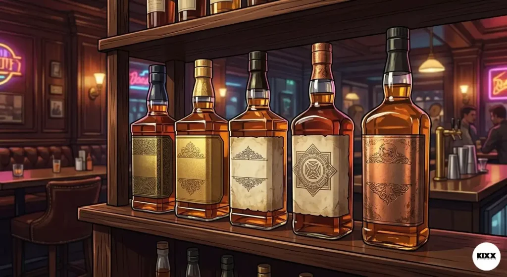
A thin, glossy label that feels like a sticker signals cheap production. A thick, textured, matte paper stock that gives slightly under your fingertips signals quality and care.
Think of it this way. Have you ever picked up a greeting card in a shop just because the paper felt luxurious? The same principle applies to whiskey labels. Tactile experience is a massive driver of perceived value.
Paper Stocks That Signal Premium Quality
Cotton and laid paper stocks are popular choices for premium whiskey labels. They have a natural, slightly rough texture that feels expensive and authentic. Many of the world’s most prestigious whiskey brands use paper that feels more like fine stationery than a label.
Uncoated paper stocks take ink differently than coated ones. Colors look slightly more muted and organic, which actually works in favor of brands going for a heritage or craft aesthetic.
For ultra-premium expressions, some brands even use hand-torn edges on their labels, giving each bottle a one-of-a-kind feel that perfectly reinforces a “handcrafted” story.
The Role of Embossing and Debossing
Embossing raises elements of the label off the surface. Debossing presses them in. Both techniques add a three-dimensional quality to a label that you simply cannot achieve with flat printing.
A debossed crest or embossed brand name is something a customer can feel with their fingertip. It says, “This brand paid attention to every single detail.” And when someone is about to spend thirty, fifty, or a hundred dollars on a bottle of whiskey, that kind of attention to detail matters enormously.
5. The Label Shape and Bottle Silhouette
A whiskey label does not exist in isolation. It lives on a bottle. And the relationship between the label shape and the bottle shape is a crucial part of great whiskey label design.
Most people think about the label first and the bottle second. The smartest brands think about them together, as one cohesive object.
How Label Shape Affects Perception
A tall, narrow label on a tall, elegant bottle creates a sense of refinement and length. It makes the eye travel upward, making the bottle appear taller and more imposing on a shelf.
A wide, squat label on a round bottle feels abundant and generously sized. It is a great choice for whiskeys that want to feel warm, approachable, and indulgent rather than austere.
Die-cut labels, where the label is cut to a custom shape rather than a standard rectangle or oval, are a powerful differentiator. An unusual label shape immediately signals that this brand has put real thought into its packaging.
Some of the most iconic whiskeys in the world are immediately recognizable from across a room purely by the shape of their label. That kind of recognition is worth its weight in gold.
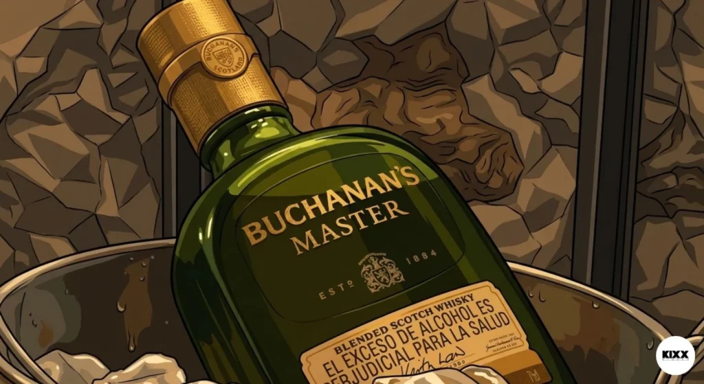
Matching Label to Bottle Shape
If you are designing a label for an existing bottle shape, study it carefully before you start. Where is the widest point? Where does it curve? How does light hit the glass?
A great label works with the bottle’s natural contours. A great label lets the bottle breathe around it. Some of the most effective premium labels are actually quite small, because they trust the bottle itself to do some of the communicating.
6. Special Finishes That Create a Luxury Feel
We touched on embossing and debossing already, but special finishes in whiskey label design go much further than that. These are the finishing touches that take a good label to a great one, and a great label to an unforgettable one.
Here is something most people do not know. In consumer research, buyers consistently rate products with foil or special finishes as being higher quality than identical products without them, even when the price is the same. Special finishes change how value is perceived at a subconscious level.
Foil Stamping: The Gold Standard of Premium
Foil stamping involves applying a thin metallic film to specific areas of a label using heat and pressure. Gold foil is by far the most popular choice in whiskey packaging, but silver, copper, rose gold, and even holographic foils are used for specific brand effects.
Foil catches light dynamically. As a bottle rotates in someone’s hand, the foil element catches different angles of light, creating a living shimmer that feels precious and special. It is one of the most reliable ways to communicate luxury at a glance.
The key is restraint. A label that is completely covered in foil can look garish rather than premium. The most effective use of foil is selective, picking out a crest, a key word, or a decorative border element and letting it gleam against a matte or textured background.
Spot UV Varnish: Subtle but Powerful
Spot UV is a technique where a high-gloss varnish is applied to specific areas of a label while the rest remains matte. The effect is a contrast between gloss and matte that catches the eye and feels incredibly refined.
What makes spot UV so brilliant is that it is nearly invisible until the light hits it at the right angle. This creates a moment of discovery for the buyer, a little “oh” moment when they tilt the bottle and suddenly see a hidden design element glowing under the light. That kind of sensory delight creates a memorable brand interaction.
7. Authenticity and the Distillery Story
Here is the final element, and in some ways it is the most important one. People do not just buy whiskey. They buy a story, a place, a tradition, and a set of values.
A whiskey label design that communicates genuine authenticity is one that connects with buyers on an emotional level that no amount of clever printing technique can fake.
This is the part that really comes down to knowing who you are as a brand. What makes your whiskey different? Where is it made? Who makes it? What do they care about? The answers to these questions should influence every design decision you make.
Small Details That Communicate Big Authenticity
There are specific design choices that signal authentic craft and heritage rather than generic mass production.
Hand-illustrated artwork, especially portraits of founders or scenes of the distillery itself, feels personal and real. It says that a real human being created this whiskey with their hands, not a faceless production line.
Specific geographical references, whether a county, a river, a mountain range, or even a street, anchor a whiskey in a real place. Buyers are drawn to specificity. “Kentucky Straight Bourbon” feels less personal than “Distilled at the foot of the Knobs, Bardstown, Kentucky.”
Handwritten elements, even if they are a printed facsimile of a handwritten signature or a batch number, add a sense of personal connection. When a bottle looks like someone signed it, it feels personal.
The Role of Honest Labeling
This is worth saying clearly. In an age of increasing consumer skepticism, honesty on a label is a genuine competitive advantage.
Buyers today are smarter and more informed than ever. They know when something is designed to trick them into thinking a product is something it is not. They can spot fake heritage and manufactured authenticity a mile away.
The most powerful whiskey labels are honest ones. They tell the true story of the whiskey, the real place it comes from, the real people who made it, and the real process that created it. When those truths are genuinely interesting, and in craft whiskey they almost always are, they become the most compelling sales story a label can tell.
Putting It All Together: Why Every Element Works Together
Here is the most important takeaway of this entire post. None of these seven elements works alone. The magic of great whiskey label design happens in the space between them, in how they reinforce and amplify each other.
A gorgeous font on cheap paper sends a mixed message. Beautiful paper with muddy color choices wastes its potential. Perfect color with no story leaves the buyer cold.
The best whiskey labels are systems, not collections of individual choices. Every element is in conversation with every other element. The typography echoes the heritage cues. The color palette reinforces the brand story. The paper texture backs up the foil finish. The label shape complements the bottle silhouette.
When all seven elements work together seamlessly, something remarkable happens. The buyer stops feeling like they are reading a label and starts feeling like they are meeting a brand. And that is the moment a sale is made.
Conclusion
Whiskey label design is genuinely fascinating once you start paying attention to it. What looks like a simple piece of paper stuck to a bottle is actually a carefully engineered communication device, one that tells a story, triggers emotions, and persuades buyers in a matter of seconds.
The seven elements we have covered here, storytelling, typography, color, texture, label shape, special finishes, and authenticity, are not just design tricks. They are the building blocks of brand trust. When they are used with intention and skill, they can transform a whiskey brand from an unknown name on a shelf into something people seek out specifically and recommend to their friends.
If you are working on a whiskey label, or even just curious about why you keep reaching for the same bottle every time you walk into a spirits shop, I hope this post has given you a new way of seeing what is really happening on that label.
I would love to hear your thoughts. Which whiskey labels do you think get it absolutely right? Drop a comment below and share your favorites. And if you found this post useful, pass it along to someone who loves whiskey as much as you do. Cheers.