Top 5 Logo Design Trends in 2024
Introduction
Top 5 Logo Design Trends in 2024 | By KIXX Studio
In today’s visually driven world, a well-designed logo is essential for building a strong brand identity. It serves as the face of your brand, making a lasting impression on your audience. As design trends rapidly evolve, staying updated is crucial to maintaining a modern and relevant brand image. This blog explores the top 5 logo design trends for 2024, offering insights into the latest styles and techniques to help your brand stand out and connect with your audience on a deeper level.

Trend 1: Minimalist Design
Description: Minimalism has been a prevailing trend in logo design for several years, and it’s likely to continue in 2024. This approach emphasizes simplicity and clean lines, stripping away unnecessary elements to focus on the core aspects of the design. By honing in on the essentials, minimalist logos can communicate a brand’s identity more effectively and memorably.
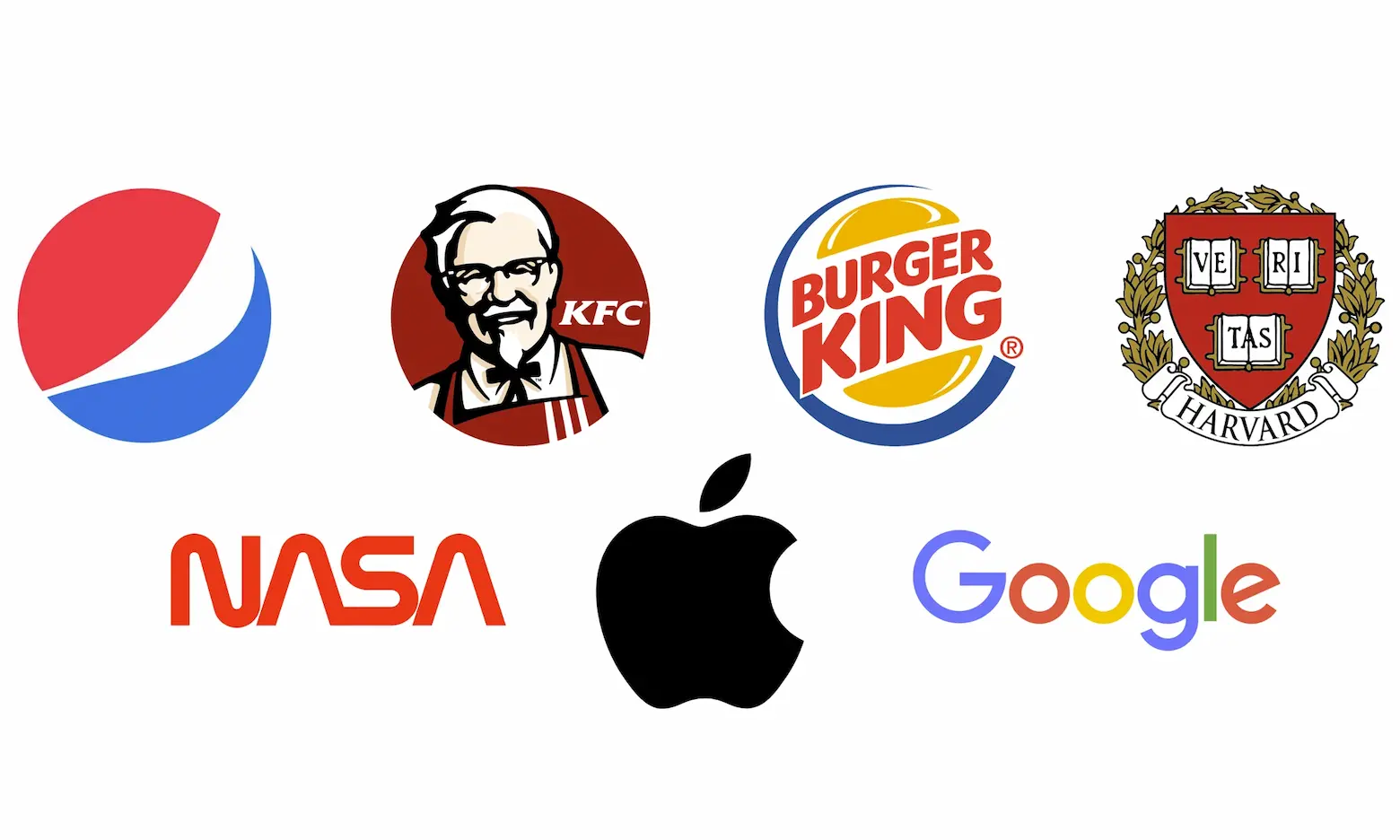
Examples: Many famous brands have adopted minimalist logos to great effect. For instance, Apple’s logo, with its sleek, bitten apple silhouette, is instantly recognizable without any extraneous details. Nike’s swoosh is another prime example, conveying motion and simplicity. Google’s logo, while colorful, maintains a minimalist approach with its clean lines and straightforward typography. These examples show how effective minimalism can be in creating a strong and lasting brand image.
Benefits: One of the primary benefits of minimalist logo design is its versatility. Clean, simple logos work well in various sizes and across different platforms, from business cards to billboards and mobile screens. This adaptability is particularly valuable in today’s digital world, where logos must be easily recognizable on small app icons and social media profiles. Additionally, minimalist logos have a timeless appeal, avoiding the risk of appearing outdated as design trends evolve.
Tips: Achieving a minimalist logo involves several key steps:
- Focus on Essentials: Identify the core elements of your brand and incorporate only what’s necessary. Avoid clutter and excessive details that can detract from the primary message.
- Simple Shapes and Clean Lines: Utilize basic geometric shapes and smooth lines to create a clear and uncluttered design. This helps in maintaining the logo’s clarity and legibility at different sizes.
- Limited Color Palette: Stick to a minimal color scheme, using a few harmonious tones that complement each other. This not only enhances the visual appeal but also ensures the logo’s versatility across various backgrounds.
- Scalability: Ensure that your logo looks good whether it’s displayed on a small mobile screen or a large billboard. Test its appearance at different sizes to make sure it remains effective and recognizable.
- Versatility: Test the logo on different backgrounds and mediums to ensure it maintains its integrity and visibility. A good minimalist logo should be adaptable to both digital and print formats without losing its impact.
By following these tips, you can create a minimalist logo that is both striking and functional, helping your brand stand out in a crowded marketplace
Trend 2: Animated Logos
Description: With the growing influence of digital platforms and the need for responsive design, dynamic logos are becoming more prevalent. Animated logos incorporate movement and interactivity, adding a layer of depth and engagement to a brand’s visual identity. These logos adapt to different contexts, screen sizes, and orientations, providing a consistent and engaging brand experience.
Examples: Several brands have effectively used animated logos to enhance their branding. Google’s Doodles often include playful animations that capture attention and celebrate various events. Another example is the animated logo of Airbnb, which transforms seamlessly between the brand’s “A” symbol and various travel-related icons. These animations not only grab attention but also create a memorable experience for the user.
Benefits: Animated logos offer increased engagement and memorability compared to static logos. The movement captures viewers’ attention more effectively, making the brand more memorable. Additionally, animated logos can convey complex ideas and emotions, enhancing storytelling and brand messaging. They are particularly effective on digital platforms, where dynamic content is more likely to be shared and interacted with.
Tips: Creating an effective animated logo involves several tools and techniques:
- Use Animation Software: Programs like Adobe After Effects, Blender, or even simpler tools like Canva and Crello can help you create engaging animations. These tools offer a range of features to animate different elements of your logo.
- Start with a Strong Static Logo: Ensure your base logo is simple and versatile. A strong foundation will make it easier to add effective animations.
- Focus on Subtle Movements: Sometimes, less is more. Subtle animations, like a slow reveal or a gentle transformation, can be more effective and less distracting than complex animations.
- Ensure Scalability and Flexibility: Test your animated logo across different devices and screen sizes to ensure it looks good everywhere. It should load quickly and not hinder the user experience.
- Align with Brand Messaging: Make sure the animation style aligns with your brand’s personality and message. For example, a tech brand might use sleek, fast animations, while a children’s brand might use playful and bouncy movements.
By incorporating these tips, you can create animated logos that enhance your brand’s visibility and engagement, making a lasting impression on your audience
Trend 3: Vintage Revival
Description: Vintage revival in logo design draws inspiration from past decades, bringing retro aesthetics back into the limelight. This trend often incorporates elements such as classic typography, nostalgic color palettes, and old-school illustrations. By channeling the charm and character of bygone eras, vintage logos can evoke a sense of nostalgia and authenticity.
Examples: Several brands have successfully leveraged vintage aesthetics to create unique and memorable logos. For example, Coca-Cola’s timeless script logo has a nostalgic appeal that resonates with consumers across generations. Similarly, the logo for Levi’s, with its classic red tab and heritage-inspired font, reflects the brand’s long history and enduring quality. These examples show how vintage elements can be used to establish a strong brand identity.
Benefits: The primary benefit of vintage revival logos is their ability to evoke nostalgia. This emotional connection can create a strong bond between the brand and its audience. Additionally, vintage logos often stand out in a sea of modern, minimalist designs, giving them a unique edge. They can communicate a brand’s heritage and longevity, instilling trust and a sense of reliability.
Tips: Balancing vintage elements with modern touches is key to creating an effective vintage revival logo:
- Combine Old and New: Blend retro typography and classic design elements with contemporary colors and layouts to keep the logo relevant and appealing.
- Use Authentic Textures: Incorporate textures like grain, distress, and halftone to give the logo a genuine vintage feel. However, ensure these elements are used subtly to avoid overloading the design.
- Focus on Simplicity: While vintage designs can be ornate, maintaining a level of simplicity ensures the logo remains versatile and clear.
- Stay True to Brand Identity: Ensure that the vintage elements align with your brand’s story and message. The logo should reflect the brand’s values and heritage without appearing outdated.
- Test Across Mediums: Make sure the logo looks good in both digital and print formats. Vintage designs can sometimes lose their charm on screens, so testing is crucial.
By thoughtfully integrating vintage elements with modern design principles, you can create a logo that is both nostalgic and unique, helping your brand stand out and connect with audiences on a deeper level.
Trend 4: Abstract Geometry
Description: Geometric shapes and patterns can create visually striking and memorable logos. Circles, triangles, and other geometric elements provide a sense of balance and order. This trend often involves combining geometric shapes to form unique and meaningful symbols, adding a modern and timeless touch to the brand identity.
Examples: Many contemporary brands use abstract geometry in their logos. The logo for Adidas, featuring three parallel bars forming a triangle, is a prime example. Another example is the logo for Google Drive, which uses a combination of geometric shapes to create a dynamic and recognizable symbol. These logos are modern, versatile, and easy to remember.
Benefits: Abstract geometry provides a modern and dynamic appearance. The clean lines and balanced shapes can convey a sense of stability and professionalism. Additionally, geometric logos are highly versatile and can be easily adapted for various media and applications. They also tend to be timeless, as geometric shapes are foundational elements in design that don’t go out of style.
Tips: Creating an abstract geometric logo involves several key steps:
- Combine Shapes Thoughtfully: Use different geometric shapes to form a cohesive and unique design. Experiment with combining circles, triangles, squares, and other shapes to find a composition that represents your brand effectively.
- Maintain Balance and Proportion: Ensure that the shapes are balanced and proportionate. Symmetry can often enhance the visual appeal and make the logo more pleasing to the eye.
- Use Negative Space: Incorporate negative space creatively to add depth and interest to the logo. This can make the design more engaging and memorable.
- Limit Color Palette: Stick to a simple color scheme to keep the focus on the geometric shapes. A limited palette can also enhance the logo’s versatility and adaptability.
- Ensure Scalability: Test the logo at different sizes to ensure it remains clear and recognizable whether it’s on a business card or a billboard.
By combining geometric shapes thoughtfully and maintaining balance, you can create an abstract geometric logo that is both distinctive and modern, helping your brand make a strong and lasting impression.
Trend 5: Custom Typography
Description: Typography plays a crucial role in logo design, and custom lettering can give a brand a distinctive and authentic feel. Unique, hand-drawn, or custom fonts help brands stand out and convey a personalized touch. This trend allows for greater creativity in expressing a brand’s personality and values through its visual identity.
Examples: Several brands use standout typographic logos to great effect. Coca-Cola’s iconic script logo is an excellent example of how custom typography can define a brand. Another example is the logo for Netflix, which uses a custom typeface to create a bold and recognizable mark. These logos demonstrate how unique fonts can enhance brand recognition.
Benefits: Custom typography provides personalization and strengthens brand identity. A unique font can make a logo instantly recognizable and memorable. It also allows brands to convey their personality and values more effectively, creating a stronger emotional connection with their audience.
Tips: Creating or selecting the right custom typography involves several key steps:
- Understand Your Brand: Before designing or choosing a font, ensure you have a clear understanding of your brand’s personality, values, and message. The typography should reflect these elements.
- Hire a Professional: If possible, work with a professional typographer or designer to create a custom font that aligns with your brand identity. Hand-crafted fonts can provide a unique and authentic feel.
- Ensure Legibility: While creativity is important, legibility should not be compromised. Ensure that the custom typography is clear and readable at different sizes and across various platforms.
- Test Across Mediums: Check how the custom typography looks in different contexts, such as on digital screens, printed materials, and signage. Make sure it is versatile and adaptable.
- Balance with Other Elements: Ensure that the custom typography works well with other design elements in your logo, such as icons or color schemes. The overall design should be cohesive and balanced.
By focusing on custom typography, you can create a logo that is unique, personal, and reflective of your brand’s identity, helping you stand out in a competitive market.
Conclusion

KIXX Studio
At KIXX Studio, we're all about crafting unforgettable brand experiences. From logo design to website creation, we bring your vision to life with creativity and care. Based in New York City, we serve clients worldwide, offering not just brand services but also stunning wall art and insightful eBooks. Let's tell your story together, beautifully and authentically. Welcome to KIXX Studio.